Tag Archives: Robert Irwin

a palm garden takes shape

I’m sure I’m not the first to have noticed the irony: The main approach to Los Angeles County Museum of Art takes you through the BP Grand Entrance. The back way in takes you through the La Brea Tar Pits.

When I took the photos on the last day of July crude oil was still gushing into the Gulf of Mexico, and the irony was heavy like the odor of tar coming from the fenced-off pits where archaeologists were working behind the museum on extracting critters and plants that got caught in the ancestral goo.

Here, junior’s ball has somehow made it over the fence around one of the pits. You could maybe rescue it with a stick…or you could wade through the tar and hope that you don’t get caught, only to be discovered by archaeologists a few millennia down the road.

We arrived at the museum an hour before it opened, via the back entrance, so we had a chance to spend some time with Robert Irwin’s Palm Garden Installation. I posted [ before ] on the earlier stages of the garden, and it’s still not complete. But by now you can really make out many more of the elements of what the final garden will look like.

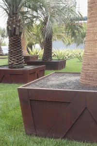
There are many palm species used in the garden. A number of them are planted in a lawn, inside planter boxes that mimic the wooden planter boxes the trees were grown in. But unlike the wooden temporary planters, these permanent homes are made out of thick steel plate–the “it” material of the moment for well-financed modern gardens.

A closer look at the planter box…

In a back corner you could see a collection of palms in pots, and in this photo you can get a better idea of the kind of planter box the steel ones are meant to suggest.

Another look at some of the palms in transition… In this installation some of the plants are rotated out according tot he season. I’m not sure whether these are headed in or out.

LACMA was about to open a new facility, the Resnick Pavillion designed by Renzo Piano. As the building nears completion more elements of the Palm Garden Installation are being planted. In addition to palms it includes several of the non-palm species. These are some spectacularly variegated agaves plants of a furcraea, possibly Furcraea foetida ‘Mediopicta’–Thanks for the correction, Loree!

The way the plants have been shaped, with the lowest leaves removed, made them look like variegated New Zealand flax (phormiums) until you got close to them. It’s not a bad look. It’ll be interesting to see if these agaves furcraeas are kept pruned this way or whether they’ll be allowed to grow into the rosettes that agave furcraea growers are used to seeing. This is in no way a naturalistic garden, so my guess is that the agaves plants will be kept this shape. Besides, how do you mow around them without running over the leaves?

Detail: Furcraea foetida, I think

Another detail of the variegated furcraeas

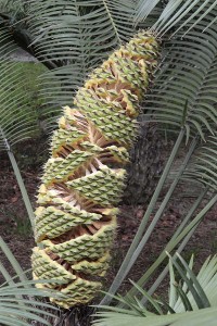
Another of the non-palm species: this cycad developing this really cool cone. It’s probably something like three to four feet long.

A bench and real palms outside the Resnick pavilion…

The single most dramatic gesture is the placement of this palm with a thickly bulbous trunk that’s been planted in a tight opening that leads two stories down into a parking garage. The effect is like staring down into a North Dakota Minuteman missile silo. It’s more than a tad unsettling, and asserts that garden-making can be about more than designing pleasant, unchallenging spaces.

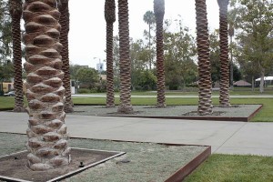
Say “Los Angeles” to someone and ask them what comes to mind. Palm trees would probably be one of the first things the person might bring up, even though the city’s official tree is the coral tree is and the official flower the bird of paradise. “Cars” would probably be another. Here palms and cars come together, with a short arcade of the trees lining the driveway down into the parking garage.

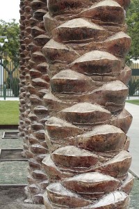
I’m not anything remotely resembling a palm expert, so I can’t tell you what species this is. But I can show you that it has amazingly sculptural trunks.

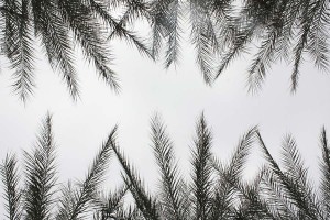
Looking up into the fronds gives you the sensation closest what you get from many of the artworks Robert Irwin did before he designed gardens. The fronds filter the light in interesting ways, and two or more layers make things darker than just a single layer. If you stand in the driveway and look straight up the negative space of the sky reads like a bright zigzag between the delicate layers of palm.

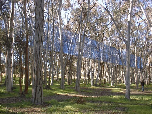
If you’d like to compare the effect of the palm fronds to an earlier Irwin piece, here’s a corner of his Running Violet V Forms, a piece that I walk around and under at least twice a week. In this 1980s piece panels of violet-colored mesh turn light or dark, depending on the number of layers, and the mesh turns opaque or transparent depending on how the light is striking it. The mesh interacts with views of the eucalyptus grove where it’s placed. I’ve loved this piece ever since the day it went up. You can read my love story with this piece [ here ].

Artists often complain that big museums don’t pay enough attention to local artists in their scramble to show off big-name artists from the other coast or another country. This summer day LACMA had several galleries devoted to the the photographs of Cathy Opie, and work of other local artists could be found the walls of several of the galleries. But I didn’t identify any plant species used in this garden that came from within a thousand-mile radius.

Word is that Robert Irwin is designing yet another garden, this one for a new federal courthouse here in San Diego. Wouldn’t it be great if he could use some of our California species in the project? What about some of our delicately transparent plants like deer weed or broom baccharis? Or what about some of the many plants that undergo stunning transformations as the seasons change? To see an important new, high profile garden comprised of local natives would be such an amazing opportunity.

getty garden, light and shadow

I try to stop by Robert Irwin’s Central Garden at the Getty Center whenever I’m nearby. This early august day was bright but cool, a perfect day for a stroll through the garden to see what new things I’d find.

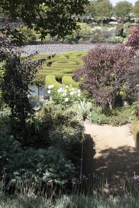
If you’ve never been to the garden, it divides into two large parts: a central bowl holding a maze of two colors of clipped azaleas and its surrounding plantings, and, above it, a straight watercourse that is shaded all along its length by London plane trees, a cousin of the American sycamore.

This trip I was concentrating on how the idea of light and shadow, dark and light played out in the overall design and plantings.

To experience the upper watercourse, you follow a path that zigzags back and forth. It takes you in and out of the shade and shelter of the trees, letting you experience the bright Los Angeles sunlight and how it contrasts with the dappled light the trees provide in the spring, summer and fall.

The watercourse near the top of the Central Garden

The watercourse, the sheltered core of this top garden, changes from a noisy stream with large stones in its path at the top, to a waterway that glides quietly over a textured streambed down below.

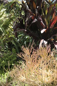
The effect of the dappled sunlight is repeated in the plantings. Dark, almost black-leaved, plants alternate with light-colored ones. In this photo it’s almost hard to distinguish the alternating light and shadow of the trees above from the dappled plantings below. It’s a little confusing, a tad disorienting. And if you’re fascinated with the effects of light and shadow as I am, you might find it a quietly thrilling experience.

Even this little detail, a planting of succulents, plays with contrasts, light and dark. It’s a little corner that would look great in a home garden, and here it further helps to reinforce the vibrations of light and dark in the upper garden.

When I first saw the garden I thought the plantings were a little chaotic. All this light and dark, all this continual contrasting of colors and plant shapes seemed restless. Small doses would look great as perky little container plantings, but it seemed way too much of a good thing. It seemed like a little English cottage garden doped up on steroids.

But I’ve been changing my mind. All this craziness reinforces the intense vibration of contrasts that you experience walking the zigzag path.

Once you make your way out of the upper portion of the garden you’re set free into the relative calm of the lower bowl. There’s no more zigzagging in and out of the shade, there’s no more quick shifting from light to dark. Still, the sunken design of the lower garden ensures that one of the sides will experience shade during most of the day. And the plantings down here, still alternating dark and light, tell you that you’re still in the same garden.


Yes, each trip here I see something new. But I also realize that making this kind of garden happen is such an extreme commitment of resources and labor.

I haven’t quite figured out a way to photograph the capital outlay it takes to keep this garden looking great. But I’d like to end this post with a tribute to the heroes, those dedicated gardeners who make this place a garden worth visiting several times a year.

Thanks, guys!

garden designer, artist

Any rabid garden enthusiast visiting Los Angeles will probably want to put Robert Irwin’s Central Garden at the J. Paul Getty Museum on their list of places to visit. I’ve written about it a few times, including [ here ] and [ here ], and so have a lot of other bloggers. Robert Irwin is also involved in an installation of palm trees at the Los Angeles County Museum of Art.

The garden-making is a fairly recent addition to the projects of this amazing artist. Before taking on biological materials he created a rich body of work that plays with subtle ways you perceive light and space. Yesterday I had a chance to visit a show of some work in progress to see what he’s doing these days.

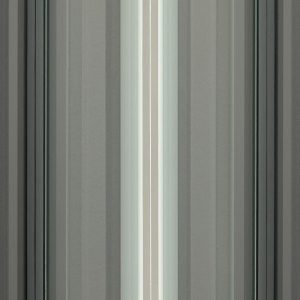
Robert Irwin. #4 X 8' Four Fold (detail) 2010. Photo credit: Philipp Scholz Rittermann

To look at this image to the left you’d maybe swear that this is a painting of stripes. But step into the gallery and you realize that these works are actually made out of evenly spaced fluorescent tubes, each of which has been wrapped in gels to modify their color and to provide linear patterns on the face of the bulbs. Most of Irwin’s art uses simple techniques like this, but the more you look, the more you get pulled into them.

The effects are so subtle photos can’t really do complete justice to the pieces. But the photographer, Philipp Scholz Rittermann, one of our local really talented camera guys, has made a beautiful interpretation.

You can see the vertical lines of the tubes, the lines of the dark gels, the subtle colors the tubes cast onto the fixtures and the spaces between them, and the delicate shadows of the fixtures. The tubes, the gels, the fixtures, the shadows–everything works together to give you a quietly rhythmic progression.

Robert Irwin. #3 X 6' Four Fold (detail) 2010. Photo credit: Philipp Scholz Rittermann

If I’m remembering the helpful gallery folks correctly, each piece has four different states, with different bulbs being on at different times. One of the big themes of the Getty garden is change–which really isn’t something you have to explain to a gardener–and these new pieces play with how different the same arrangement of bulbs appears as you turn some bulbs on and off.

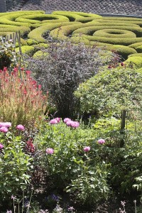
Take a look at my garden photo at the top of this post, and look how the central topiaries of two kinds of clipped azaleas uses the subtly different leaf and flower colors to create interlocked formations. Next, look at one of the fluorescent bulb pieces and notice the subtle interplays of light and shadow that make up the work. It’s the same basic principle, but applied to wildly differing materials. As the plants in the garden go in and out of bloom, as the seasons change, the relationship of the formations shifts. Same goes for what happens when some bulbs are on and others blacked out.

I don’t often leave an exhibit thrilled and tingling, but this time I did. If you can make it to the exhibition at Quint Contemporary Art in La Jolla, go quick, before the show closes May 1. Or if you’ll be in New York in the fall, I believe I heard correctly that there’ll be a show of this work at the Pace Gallery.

a visit to the l.a. county museum

Another quick stop over the holidays took the form of a visit to the Los Angeles County Museum of Art.

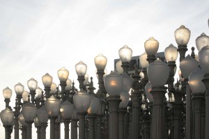
Installed at the new main entrance is this battalion of 202 antique streetlights, Urban Light, by artist Chris Burden. Streetlights like these of course were positioned at curbs in straight lines, spaced regularly. Clustering them together like this accentuates that fact, and to me makes the whole installation seem maybe just a little bit militaristic.

Arranged behind the Burden piece are some palm trees, the first plantings of what will be a large installation of palms by Robert Irwin. Irwin is the design force behind the Central Garden at the J. Paul Getty Museum, but here the trees will read less like a separate garden than plantings integrated into the art and architecture.

Their trunks echo the posts of the streetlights, as does the fact that they’re planted in a regular pattern. Also, as with the streetlights, they’re a collection of different kinds. A press release states: “Along with the palms, Irwin’s other medium is Southern California’s light, and the species of palms have been specially chosen to gather and reflect the interplay of light and shadow native to L.A.” [ source ] I love Robert Irwin’s work [ here’s a sample ], and I’ll be checking back on this installation as time goes on.

The whole vertical shaft thing becomes a theme around the Museum’s latest building, the newish Broad Contemporary Art Museum, which has red exterior accents, including plenty of red columns.

The landscaping in this part of the museum is interesting in that it uses palms or flat plantings. Virtually no shrubs. It’s a pretty urban planting that in part seems designed to give the homeless no place to camp.

Most horizontal surfaces, using decomposed granite or this Turfstone product, are designed as walkable extensions of the concrete paving. Where does the landscape end and the urban fabric begin?

Here’s an interesting gardening aside: The Museums are located on the same big city block as the famed La Brea Tar Pits, where the ground oozes black, gummy tar, a substance that has preserved bones of sabertooth tigers and woolly mammoths from the last ice age that got too close to the stuff. Just imagine trying to garden where digging a hole to plant a shrub might put you in contact with the deadly sludge! I have yet to pick up a garden book that even begins to discuss what to do with this kind of soil problem. While the park containing the tar pits has a few gooey shoe-grabbing spots, these plantings seemed free of the muck.

My main reason for visiting LACMA was to take in a photo exhibit that reassembles many of the works that were seen in the seminal 1975 “New Topographics” exhibition of landscape photography. These works in the show signaled a break from the more romantic takes on what landscape photos ought to look like and engaged a land where the human presence reigned supreme.

One of my favorite photographers in the show, Robert Adams, often combines the romantic sublime with a cooler take on what the world really looks like. To the left is “Mobile Homes, Jefferson County, Colorado” from 1973 [ source ], a great example of what his eye sees. You get the sense in his work that the human landscape often fails to live up to the stunning geography where it’s sited.

Seeing his work again prompted me to reread some of his Beauty in Photography: Essays in Defense of Traditional Values. (From this photo you can see that he takes “traditional values” pretty broadly.) Here’s a quick snippet gardeners and landscape designers might like to think about.

Not surprisingly, many photographers have loved gardens, those places that Leonard Woolf once described as “the last refuge of disillusion.” Gardens are in fact strikingly like landscape pictures, sanctuaries not from but of truth.

–from the essay, “Truth and Landscape” in Beauty in Photography

In parting, let me move from beauty in photography to beauty in art. Here’s a closeup of Urban Light, backlit by the afternoon sun:


(For another example of Burden’s work, check out the installation of 50,000 nickel coins and 50,000 matchsticks that the San Diego Museum of Contemporary Art exhibited: The Reason for the Neutron Bomb.)

let it rust

Picasso and on occasion other artists have been credited with the quote that goes something like, “Good artists copy, great artists steal.”

Getty garden

Left: Garden at the Getty Center, Los Angeles [ source ]

The garden designed by Robert Irwin at the Getty Museum in Los Angeles has both received raves and been the topic of rants. After my visits there I’m torn somewhere in between. There are things I like about it, and there are things that seem like missed opportunities or inappropriate choices.

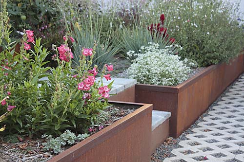
One of the things I really like is its use of sheets of steel for retaining walls. (You can see it in the foreground and middle-ground in this picture.)

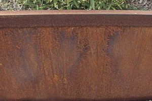
Each material that you use in a garden–whether it be wood or stone or steel–has its own personality. I particularly like the warm brown color that that steel ages to, as well as the industrial vibe that it brings.
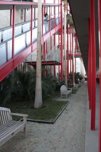
While it probably doesn’t rise to the Picasso’s level of theft, using sheet steel for retaining walls is an idea I’ve incorporated into my own garden. Two sides of the raised bed I put in last fall use the material.

Steel retaining wall

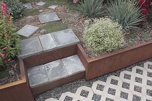
Steps in steel retaining wall

My gardening budget is nothing like the Getty Museum’s, so instead of inch-thick material I used 11-gauge sheets (just shy of 1/8 inch thick). Also, since steel is heavy stuff, thinner sheets don’t require heavy equipment and can be handled by two people. I welded inch-and-a-half angle iron to the top edges, both to give it extra rigidity to help hold back the soil and to give my scrawny little sheets some visual heft.

Patina on steel

Over eight months the walls have taken on a warm patina and are almost as alive as the plants in the bed.

I don’t consider myself to be mainly swayed by practicality over aesthetics. Since steel rusts and degrades over time, using it for a retaining wall is probably a less durable option than using other materials. Still, as far as the longevity of the steel is concerned, I’m encouraged by a scrap that I’ve had outdoors for the last ten years. When I cut into it recently the interior was pristine and shiny. Only the outer shell showed any signs of rust. Of course, steel that’s in constant contact with the ground and moisture–like my garden retaining wall–will degrade quite a bit faster.
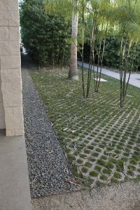
We’ll see whether this is a five-year solution or one that will outlive me.

"garden art"

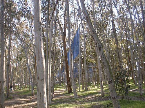
Set in the fake forest of UCSD’s eucalyptus groves is one my favorite artworks. Robert Irwin’s Two Running Violet V Forms was installed in 1983 as part of the campus’ Stuart Collection of site-specific outdoor art. The piece, like much of the artist’s output, is a subtle presence that takes a while to absorb.

Here’s how you might encounter it, approaching on a path through the trees:
irwinencounter.jpg

The piece is pretty unassuming and is almost not there. Stainless steel posts raise two V-shaped runs of a tight blue-violet colored chain-link mesh up into the tree canopy. That’s basically all there is to it, materially at least, which of course would be basically saying the same thing as a Mark Rothko painting is a piece of stretched cloth with some paint applied to it.

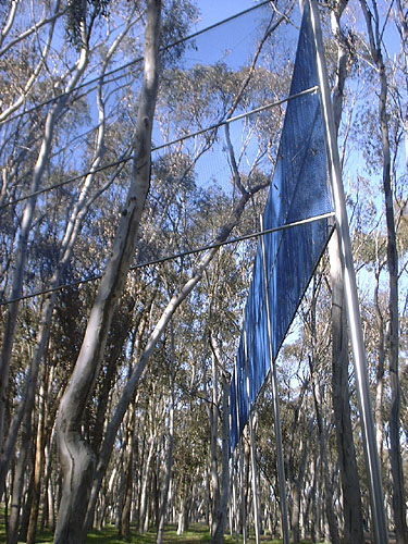
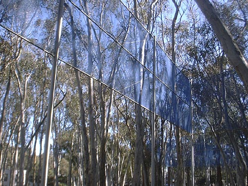
Once you add some light, the magic happens. Depending on where you stand and depending on how the light hits it, the piece’s panels are either almost transparent or absolutely opaque. What looks transparent subtly darkens and colors what you view through it. The panels that appear opaque accept shadows of the surrounding branches gracefully.

irwincorner.jpg

Move around the work and things change. What starts out transparent turns opaque; what begins as opaque dissolves into a blue-violet vapor. Visits during sunny weather end up being subtly different from those on overcast days. Like the living trees around it, the piece responds to the weather and its surroundings.


irwinlayers.jpg


irwinlongside.jpg

To the general public Robert Irwin is now probably most famous–to me unfortunately so–for designing the Central Garden at the J. Paul Getty Museum in LA. It’s a beautiful and interesting garden, but not one that shows off what he does best. The Getty website talks about the garden as “always changing, never twice the same,” which any gardener would say about their own garden. But it also is a description I’d apply to the piece at UCSD.

It’s interesting that the Running Violet V Forms, from 20 years earlier than the Getty garden, also has a botanical element. The Stuart Collection description mentions that “[p]urple flowering iceplant, echoing but not matching the color of the chain link, is planted under the fence.” When he was working on the Getty garden, Irwin was quoted declaring himself not to be a gardener, and of his working with plant consultants to complete the design. This is where bringing in a plant consultant at UCSD might have resulted in a different artwork. Today, the iceplants live on only as one or two little mounds that almost never bloom. You wouldn’t take them to be intentional parts of the artwork. Planted in the fairly deep shade of the understory, these sun-loving succulents live out a meager existence, deprived of the very light that gives life to the artwork high overhead.