Tag Archives: color

monkeyflower spectrum

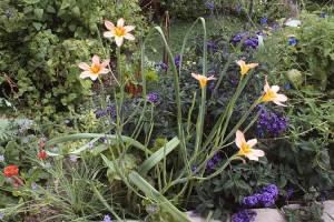
Yesterday I went out to Crestridge Ecological Preserve, about a half hour’s drive from coastal San Diego. There will be lots of photos from the trip, but here’s a little panorama to get started, featuring the common sticky monkeyflower, Mimusus aurantiacus.

Around here you can easily find clones of it that are soft apricot-yellow, or ones that are orange, or scarlet. I’d read somewhere that pretty much all the forms west of Interstate 15 were scarlet, and all of those east of it were apricot. It was supposed to have something to do with coastal plants supposedly being pollinated by hummingbirds, while those inland were visited by bees. (EDIT, May 9: Another source I just looked at mentioned that the primary pollinator of the pale form was the hawk moth, which makes sense for an adaptation towards larger, paler flowers.)

Well, what do you make of this? The top composite shows the plants, below are the details of the flowers on the plants. (You’ll definitely have to click to enlarge this photo to make sense of this wide panorama.) On this north slope were five plants that showed the complete range from apricot to scarlet, and the plants were arranged sequentially as if they lines in a spectrum. Crestridge is a couple dozen miles east of I-15, so I think these plants blow the I-15 hypothesis out of the water.

I’d guess the real answer will implicate plant-sex and require a more nuanced understanding of how these different color forms establish themselves in different areas.

more december colors

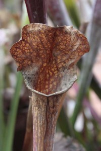
Red and green seem to be the predominant colors these days. Instead, how about a shot of hot magenta-pink against green? Of all my pitcher plants this season Sarracenia Daina’s Delight is probably looking the best of any of them.

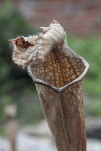
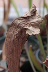
Vivid colors aren’t the rule this late in the season, with brown being the increasingly prevalent shade. With fewer things like color to distract you it’s a good time of year to concentrate on the amazing shapes these pitchers assume. In their brown state it’s easier to see the little hairs on the leaves that direct the insects down into digestive juices.


For you color addicts there’s still a bit of color left. This species is Sarracenia rubra var. wherryi (a.k.a. S. alabamensis var. wherryi.)

And for you color addicts who like a more traditional red and green combo, could you do any better than this? It’s a cross nicknamed ‘W.C.’ by Jerry Addington after Karen Oudean’s Willow Creek Nursery, in honor of Karen bestowing on him this clone of the hybrid of S. (psittacina x rubra) x leucophylla.

Hmmm…how about a cross between Daina’s Delight and W.C. for gorgeous late season color and awesome patterning? If they both bloom next spring I just might have to make that cross and find out…

white solstice

The year's first carpenteria, which opened on December 17th, shown here with an appreciative local critter on the stamens.

Winter Solstice is a celebration for optimists. Six months of ever-diminishing sunlight leads up to this, the day with the longest, darkest night. If you weren’t an optimist or schooled in the rational ways of the world you might expect the days to diminish into perpetual darkness–No wonder the Mayan Long Count Calendar ends on this day in 2012. A pessimist could see this day as the beginning of the end of time.

But I know things are about to change. The duration of the sunlight I find so precious is about to start to increase. The plants that are beginning to sprout will take advantage of the extra light and grow faster and run headlong into California’s manic late-winter, early-spring season of flowering and regeneration. Call me an optimist. It may be tough now, but to appropriate the words of Dan Savage in his campaign to fight bullying of LGBT young persons, It gets better!

Here’s a brief white-themed gallery in case you’re dreaming of a white solstice. We have no snow to offer you, but instead how about some bright white flowers, some white leaves to get you into the mood?

Have a warm and safe holiday, everyone, whether the white stuff around you is snow, foliage or blooms. It’s all about to get better, soon.

The local chaparral currant, Ribes indecorum, a plant new to the garden within the last year, coming into bloom for the first time.
Detail of the chaparral currant flowers.
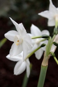
December paperwhite narcissus
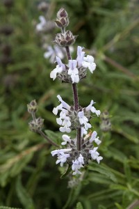
Early-season blooms of black sage, Salvia mellifera. The overall color is really more pale violet than white.
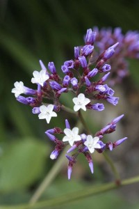
Flowers on a volunteer statice plant, Limonium perezii. The bracts give the flowering structures a lavender look, but you can see that the flowers are actually white inside the bracts. The closest neighbor's plant of this is a few hundred feet down the street. I had no idea the seeds could travel so far. Enjoy it now. This weed is outta there once the holidays are over.
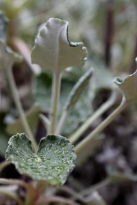
Details of the leaves of San Miguel Island buckwheat, Eriogonum grande, green on top, white beneath...

The white-ish Dudleya brittonii with December precipitation, rain, not snow...

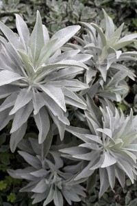
Who could forget our great local white sage, Salvia apiana?

...and one of our great local dudleyas, D. pulverulenta, one of the whitest of the dudleyas, and it loves life in my garden. Joy oh joy!

controlled chaos

I often have trouble mixing ornamentals and vegetables together in a garden bed that’s supposed to be “for company,” a bed that’s meant to be attractive as well as containing tasty-looking plants that you’d like to take to the dinner table.

red-and-blue-and-purple-1

red-and-blue-and-purple-2

Some parts of the garden where I’ve snuck veggies in with the other plants look a little chaotic, but here’s a patch that I really like the looks of. Earlier I showed part of this corner that the bedroom window overlooks. But new things are starting to bloom, and the colors are starting to really click for me.

When I was putting this bed together, I set myself the main rule of “nothing yellow.” In deciding what veggies to place there, I just stuck to that organizing principle. (Okay, can you tell that I work in libraries and organize information during the week?)

This bed features several edibles: red-stemmed chard, orange-stemmed chard, Red Winter red Russian kale, red beets, plus catmint for tea (and for the cat). The ornamentals include scarlet geum, purple heliotrope, violet blue-eyed grass, the salmon-colored bulb Homeria collina, two blue sages (Salvia sagittata and Salvia cacaliaefolia) plus a few other things not in bloom.

For sure, there’s a lot of red and blue and purple going on here. But several variations on green in the background green do wonders to pull together what might otherwise be chaos.

I’m going to hate cutting any of these veggies for dinner…

dramatic wall colors and plants

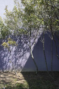
I still haven’t gotten around to doing something about the color of the my little detached studio behind the house. Colors of residential neighborhoods and garden walls usually tend towards pretty neutral shades. Here are a couple combinations of walls with plants that I thought were pretty dramatic while still being flattering to the landscaping. They could be interesting choices for garden walls or even–if you’re truly brave–walls of your house.

tustin-marketplace-wall-and-plantings

This first one is the freeway side of the Tustin Marketplace in Orange County, as see from Interstate 5 on my way up to LA last week. The fairly dark burnt red-to-salmon wall coloration mixes dramatically with the green bougainvillea foliage and reddish magenta flowers in the foreground. And the silver trunks and bright green foliage of the trees in the background stand out dramatically against the wall.

purple-wallThe second is another retail situation, the plantings by the parking lot at the Mission Valley Mall here in town. The violet wall, as the preceding reddish one, once again plays against the silver trunks of the trees and the bright green leaves.

The first combination to me feels warming and energetic without being too hyper, with the red being a color that isn’t so far removed from the Mediterranean themed housing that continues to be popular in Southern California. The second is definitely cooler, more restrained–and maybe a little more urban and adventurous.

We’ll see how brave I am when I finally have time to address residing the studio and rebuilding the attached patio cover. But I’m definitely feeling like doing something other than white or beige this time…

gbbd: pretty purple

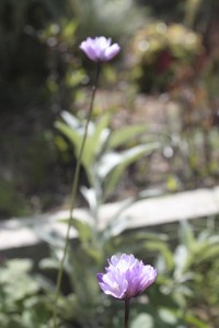
For this Garden Bloggers’ Bloom Day I’ve picked some predominantly purple spring-flowering plants that are starting to do their thing in my garden. All but one of these are California (or Baja California) natives, and all would be seriously water-wise choices for the garden. Some would even make it through an entire summer without water, though they’d look just a little better with a sip once or twice a month.

blue-eyed-grass-closeup

blue-eyed-grass-with-chard-and-heliotrope

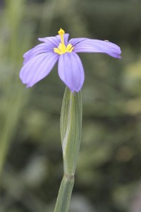
Blue-eyed grass (Sisyrinchium bellum): What a great name for a great plant. This iris relative is happy coexisting in a moderately-watered garden with other plants, though they can stand drought. Here they are living alongside some chard and heliotrope.

bluedicks

bluedicks-2

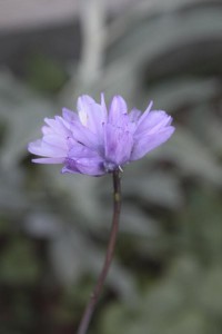
Blue dicks (Dichelostemma capitatum) are common here near the coast and are one of our reliable signs that it’s spring. They self-sow and spread around the garden, but not obnoxiously.

salvia-mellifera

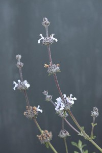
Black sage (Salvia mellifera) is one of the local canyon plants that’s earned a place in the garden. In life the flowers are a slightly stronger pale mauve color than here in the photo. It’s just beginning to come into flower and should be a little more intense in a couple weeks. Though not one of the “look at me” sages, it’s still quietly beautiful.

verbena-lilacina

verbena-lilacina-2

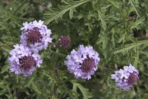
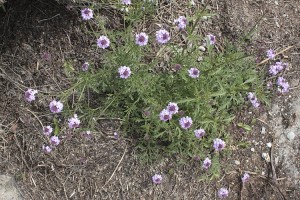
Verbena lilacina originates in Baja. The plant shown here is just getting started. It should flower much of the year and require very little summer water.

morea-tripetala

This one’s maybe closer to blue than purple, the South African bulb Morea tripetala. I stuck it in a really dry spot, and it’s now probably just blooming on the reserves in the bulb. We’ll see how well it does after a season of tough love in the garden.

penstemon-margarita

And with the last photo we come back to California with the justifiably ever-popular Penstemon Margarita BOP (sometimes sold as Penstemon heterophyllus ‘Margarita BOP’). The flowers are a wild mix of blue and magenta pink, giving the overall impression of purple. The open tubular flowers have something of the look of a foxglove which would require a certain amount of water, but this penstemon actually does just fine with almost no added water.

Thanks to May Dreams Gardens for hosting Garden Bloggers’ Bloom Day. Check out the page with glimpses into what’s blooming all around the world.

nothing yellow

Last fall’s big planting effort was a big raised bed of perennials, shrubs, bulbs, a tree fern and a tangerine tree, most of which went into the ground over the course of two months. While I don’t strive for total order in everything in my life, I was worried that assembling a bed of so many different kinds of plants all at once might quickly lead to total chaos, something on the order of those “color bowls” that they sell at nurseries and home stores.

(Okay, yes, some color bowls are well done and actually quite nice, but the worst are tossed-together plant combinations that provide work for the color-blind and are the garden equivalent of making yourself a cafeteria plate of spaghetti, frozen yogurt, fried chicken, and creamed corn, all mixed together and doused with ketchup and caramel sauce.)

To help tame the potential disorder I set myself one basic organizing principle: Nothing yellow (and only small doses of orange).

I have nothing against the color yellow, and in fact I have yellow all over the garden. But I wanted to create a quiet zone with soothing colors that would harmonize with each other. Also, one of my least favorite garden color combinations is the mix of yellow flowers with gray foliage. Banishing yellow would let me feature plants with interesting gray foliage. Still, even after ditching yellow and most oranges, it still leaves reds and purples and whites and pinks and blues–and of course the all-important green!

But once a year, for a couple weeks, the color scheme will fall apart as a cluster of kahili ginger break into bloom with spectacular and amazingly fragrant spikes of yellow flowers. There’ll be nothing else yellow in that part of the garden, and your eye will go right to the lewdly sensuous rulebreakers. Once that quick philander off the color wheel passes, though, the garden will return to its former order. Only now it’ll be enriched by heady memories of its brief indiscretion. (Hmmm, sounds like a few plot lines I’ve encountered…)

Speaking of organizing something around the absence of certain colors–and things with plot lines, John and I were watching some of the bonus features on the DVD of The Hours. In one of them the costume and production designers were talking about how they arrived at a rule to help pull together the look of the film: Nothing red, and nothing blue. Partly as a result of that organizing principle the film sustains its earth-bound moodiness as the plot hops decades and moves back and forth from England to New York to California.

So…whether you’re planning a garden or shooting a movie, remember: Pay attention to the power of color!

garden color

Color of course needs to be an important consideration in planning the garden. You may be familiar with Gertrude Jekyll’s important book devoted just to the subject, Colour Scheme in the Flower Garden. If you don’t know it—or if you your copy is falling apart—you can read it for free online via Google Books. Her selections of plants won’t apply to many locations since she lived in England, but her thought processes about choosing colors and staging processions of colors throughout the year colors are instructive and worth the read.

You can find plenty of other garden books online through Google books. If they’re out of copyright you can see the entire text. Even if they’re still under copyright control, you can skim through many others–usually enough to let you decide if you want to buy the book, and often enough to answer a specific question that might be your only reason for wanting to look at the book.

When Google started their massive project to digitize items in many of the world’s major libraries they raised more than a few eyebrows. What were they up to? What were they doing scanning all these books and potentially releasing for free the hard work of the world’s authors?

I’ve just finished The Big Switch: Rewiring the World, from Edison to Google by Nicholas Carr. It’s definitely a work of journalism and not poetry, but a paragraph on page 223 made my jaw drop and just by itself made reading the book worthwhile:

George Dyson, a historian of technology…was invited to Google’s headquarters in Mountain View, California, in October 2005 to give a speech… After his talk, Dyson found himself chatting with a Google engineer about the company’s controversial plant to scan the contents of the world’s libraries into its database. “We are not scanning all those books to be read by people,” the engineer told him. “We are scanning them to be read by an AI [Artificial Intelligence].”

Creepy. But at least in the end, when Google’s computers take over the world, they’ll at least be able to put together a color-coordinated English cottage garden.

color resources

Here’s the side view of my studio. The colors are pretty atrocious and I wanted to try out some different options.

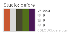
Colourlovers lets you play with colors in lots of ways, and I started there. I used their tool to extract some of the general colors of the studio from the picture above. I can’t change the brick easily, so the orange-red color is pretty much a given. I want to use foreground plantings that are mainly green, though I’ve already planted a Loropetalum chinense var. rubrum ‘Plum Delight’ which has vivid purple foliage much of the year. I made a “before” swatch combination incorporating the green and purple foliage with an orange that generally represents the brick. I also used the gray and army green colors from the studio for the first swatch. Those are the colors I want to play with modifying.
Studio: before

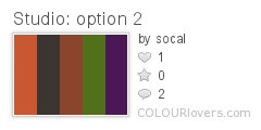
My current main idea is to do something a little more daring with the basic color, probably some in the intense blue to blue-violet range. I think the plant colors would look pretty amazing against it. About the time I redo the siding on the studio the patio will also get redone, most likely with charcoal gray/black uprights to mirror some charcoal supports I have going on in the front of the house. I’ll stare at the new swatch below to see if it really would be as cool as I think it might be. And if I don’t like that one, maybe something like the second alternate, something using rusted steel to cover the eaves and a dark, warm gray on the building… And if I don’t like those options, changing swatch colors is lots more workable than repainting everything.
Studio: option 1

Studio: option 2

While you’re at the site you can also take your swatches and turn them into plaids or stripes or a whole bunch of other patterns. A few months back I was spending waaaaay too much time playing at Colourlovers!
Studio Plaid 2
Studio 1

A similar resource, one that’s devoted just to swatches, is Adobe’s Kuler. It’s not as social a place as Colourlovers, but the interface is beautifully designed. Also, you’ll probably find more professional palette options that people have contributed. Enjoy!