Category Archives: landscape design

avoid, or embrace the inevitable?

Today I want to talk about a couple things that seem inevitable: Garden plants will die; and, concrete hardscape will develop cracks.

Strategy 1: You could try avoidance, developing ways to get around those facts.

You may have heard of the recent garden at the Chelsea Garden Show designed by James May of Britain’s Top Gear automotive program. The plants (and insects) were all made of plastic modeling paste. It was totally artificial. A garden that will never experience death—but neither will it ever experience life. (And what would you call a “garden” like this? Landscape or hardscape?)


If you want to avoid cracks in concrete walkways or patio covers, you could avoid concrete altogether. For instance, you could employ alternate materials like decomposed granite or one of the attractive alternative paving systems highlighted over at Steve Snedeker’s Landscaping and Gardening Blog.

Or you could embrace what’s going to happen anyway.

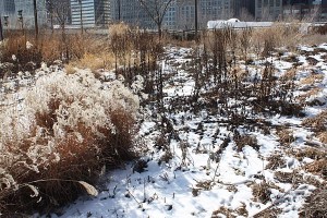
chicago-lurie-snow

Some plants look attractive after they’ve passed on for good or just for the season. To the left are some plants at Piet Oudolf’s Chicago Lurie Garden as they appeared this past February. Picking structurally interesting plants like those can keep things looking good, even in the presence of things in the garden that may be dying. This is a big and rich topic that I’ve touched on occasionally in my posts, and I’m sure to return to in the in the future in more detail.

And how do you embrace cracked concrete? I was over at Pruned, where this brilliant winner from the 2009 American Society of Landscape Architects Awards was highlighted. The project by CMG Landscape Architecture of San Francisco played up the natural tendency of concrete to crack, as well as the tendency of plants to colonize those cracks.

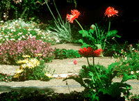
Crack garden(Photo: Tom Fox)

The recipe:

Take one piece of cracked pavement.

Jackhammering

Apply a jackhammer to widen the cracks. (Photo: Kevin Conger)

Planted crack garden

Amend the soil, and then place plants of your choosing in the enlarged cracks. (Photo: Tom Fox)

Total project cost, with homeowner labor: $500. The final results are surprising, and so is the final cost, particularly when you consider it’s a project involving professional landscape architects.

screening with wood, screening with plants

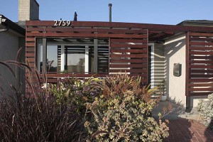
front-screent-from-walkway

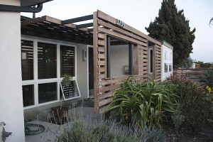
I showed the almost-complete version of this front porch screen earlier, but that was before we applied the final stain to the wood. Here it is in the really final version.

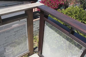
deck-railing-corner-showing-stained-and-faded-posts

deck-railing-stained-and-faded

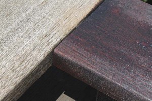
As long as we were staining wood, we got up to the deck and attacked the railings with the same stain. It had been more than a year since we’d done it last and things had faded. You can see the before and after pretty clearly in these pictures. (This project used an oil-based stain for hardwoods. They make a water-based stain that claims to last seven years, but it ended up flaking off this oily ipe hardwood on the small project we tested it on. Total disaster. Save it for softwoods.)

How do all of you react to exterior wood that’s aged to a silver color? This project is still on the new side for us and we wanted to keep it looking as it did when we first finished it. Staining all the tops and bottoms and sides of the wood is a lot of work, though. As we get less able or motivated to keep up with details around the house, I’m sure we’ll let things assume more of a Gray Gardens look.

front-screen-with-new-ceanothus

But back to the front screen… After the project was complete there was a gap between where the screen ends and the driveway. While I’m not one to put up castle walls and a moat between us and the busy street, a little more privacy seemed like a good idea.

Before, we had a couple low lavenders in front of the screen: Nice enough and they survived with virtually no summer watering. But they weren’t much of a privacy screen. Yank. Out they went.

ceanothus-tuxedo1

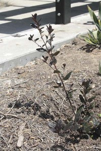
In their place is this new Ceanothus ‘Tuxedo.’ I’d done a post on some garden ceanothus not long ago, and I couldn’t stop thinking about the near-black foliage of this variety. With the lavenders gone, there was a perfect place for it.

Okay, stare at the picture of the little gallon plant and ask the obvious question: “Wasn’t the idea to install a plant that would screen the view from the street?”

Ceanothus tend to be rapid growers. This selection is new to the trade this spring, so I’m not sure exactly how rapid it’ll be. Still, I expect that it’ll approach its target size of six feet by six feet before too long. I’ll post more pictures as it fills in.

landscaping without plants

salk-looking-west

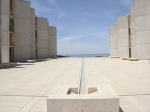
From my desk at work it’s less than a fifteen minute stroll to this viewpoint, which has got to be one of the most famous places to stand in all of modern architecture.

The view is of the central plaza of the Salk Institute of Biological Studies, which architect Louis Kahn designed for his client, polio vaccine pioneer Jonas Salk. The plaza features this simple water feature that pulls your eye towards the water, 400 feet below, and to the horizon and the sky. The materials of the plaza are reduced down to water, travertine marble and the angled concrete walls of the research buildings.

No plants. When Kahn was working on the design he’d had a conversation with Mexican architect Luis Barragán. Kenneth Frampton recounts Barragán’s seminal response in Studies in Tectonic Culture: The Poetics of Construction in Nineteenth and Twentieth Century Architecture:

“I would not put a tree or blade of grass in this space. This should be a plaza of stone, not a garden.” I [Kahn] looked at Dr. Salk and he at me and we both felt this was deeply right. Feeling our approval, he added joyously, “If you make this a plaza, you will gain a facade–a facade to the sky.”

As much as I love plants, I have to agree that this was the right decision. There’s an unphotographably joyous experience of pure space that settles into your mind as you stand or sit to contemplate the view.

salk-looking-north

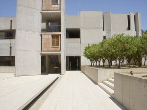
If you can pull your eyes off the horizon–not an easy thing to do–you start to notice, however, that plants do figure in the plaza’s final realization. Immediately to the east are some steps, and planting beds on either side of the steps. As with a lot of modern planting design, the planters feature one kind of plant and one kind only. Considering the planting design was executed many years ago, probably in the late 1960s or early 1970s, long before the current focus on edible landscaping, it’s surprising that the plant of choice was orange trees, at least four dozen of them. (Maybe it has something to do with the environmental ethic that was developing while the Salk was being designed, an ethic that we’re finally rediscovering today.)

Below is a 360-degree panorama from the top of the steps. Just imagine walking west towards the horizon, at dusk, on a calm evening, as the orange trees begin to flower and scent the air.

salk-panorama-horizontal

our front porch project

We began this project to redo our front porch surround last year. It’s not totally finished, but it’s at a point I thought I’d share it with you.

The house originally came with an enclosure around the little front porch/patio area that made it feel like you were behind bars, doing time for a crime you didn’t commit. We took a saw to the original porch cover and provided some breathing space in it, but it always felt like an uncomfortable retrofit. As the termites dealt a terminal blow to the first enclosure, I developed this completely reworked design, sort of a deconstructed patio cover, with openings through the front screening panel, as well as an open, incomplete canopy overhead.

porch-cover-front

This shows the shelter from the front of the house. The big window cut into the screen lets you see out into the neighborhood, while not making you feel caged.

porch-cover-front-angled

Another front view, approaching from the side of the house…

porch-cover-from-above

And a last shot from the roof, showing the partial covering overhead. Many of days are overcast, and we really would prefer sun over shade most days. This reduced cover shelters the big main window and front door, but lets more light in than an edge-to-edge cover.

The new wood needs to season just a little bit before the final finishing, and the old wood will need to be scrubbed to clean it a bit. But once the finish is on, it should really look great. I’m pleased!

Main materials: pressure-treated lumber for the support structure (painted black, to fade into the background); ipe hardwood lumber for the slats; exposed stainless steel screws for fastening the slats. The ipe hardwood is potentially the least green component of this project. Although my local lumber supplier is assuring its users that their ipe “is harvested from professionally managed sustainable forests,” some of my research is now saying that the claim just may be a crock of greenwashing. Ugh.

Choosing sustainable materials for an outdoor project is challenging. There are interesting discussions you can wade into, including an introductory Sustainable Decking Solutions post that’s worth a look. If you must use ipe, a supplier like AltruWoods can supply FSC certified lumber for a project, and might have been the better choice for getting materials for this project.

Whatever you do, reducing the amount of materials you use is a beginning. The post above recommends that “[o]ne green building idea with a lot of merit is treating wood as a luxury. Trees help the planet the most when they’re alive and globally, the acreage per forest is dwindling rapidly. Using wood as a common structural and outdoor finish material is not a long-term sustainable practice.” Good advice.

How do you all approach trying to be greener in your outdoor projects? I suppose one excellent alternative to a patio cover would have been to plant a tree. It’s a concept our grandparents would have signed on to…

dramatic wall colors and plants

I still haven’t gotten around to doing something about the color of the my little detached studio behind the house. Colors of residential neighborhoods and garden walls usually tend towards pretty neutral shades. Here are a couple combinations of walls with plants that I thought were pretty dramatic while still being flattering to the landscaping. They could be interesting choices for garden walls or even–if you’re truly brave–walls of your house.

tustin-marketplace-wall-and-plantings

This first one is the freeway side of the Tustin Marketplace in Orange County, as see from Interstate 5 on my way up to LA last week. The fairly dark burnt red-to-salmon wall coloration mixes dramatically with the green bougainvillea foliage and reddish magenta flowers in the foreground. And the silver trunks and bright green foliage of the trees in the background stand out dramatically against the wall.

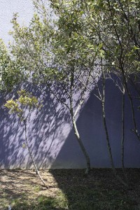
purple-wallThe second is another retail situation, the plantings by the parking lot at the Mission Valley Mall here in town. The violet wall, as the preceding reddish one, once again plays against the silver trunks of the trees and the bright green leaves.

The first combination to me feels warming and energetic without being too hyper, with the red being a color that isn’t so far removed from the Mediterranean themed housing that continues to be popular in Southern California. The second is definitely cooler, more restrained–and maybe a little more urban and adventurous.

We’ll see how brave I am when I finally have time to address residing the studio and rebuilding the attached patio cover. But I’m definitely feeling like doing something other than white or beige this time…

…and some not so garden-worthy

You could probably gather together six gardeners and get six different opinions of what would make a plant garden-worthy. But I suspect there might be somewhat more agreement on certain other plants that probably shouldn’t be included in a garden. Here are some encounters from Sunday’s trip to Tecolote Canyon that would fall easily into most people’s less-than-desirable category.
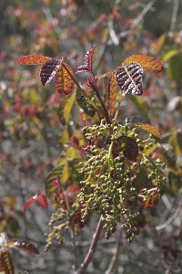
tecolote-canyon-poison-oak

I’ll have to admit to actually liking this plant to the right. During the winter it drops its leaves and is an attractive thicket of upright or sprawling branches. This time of year it starts new growth that has this warm red-brown coloration. It’ll flower soon, and then set some loose clusters of white berries. Pretty, yes, and native, and important to wildlife. But this is poison oak. Maybe not the best choice for small backyard gardens…

Most of the rest of my list below is comprised of exotic plants that have staked a claim for themselves at the expense of the native species. Different locations have their own list of invasives, so what you see below is tailored to Southern California. Some of these plants could be good choices for other locations. Others would be trouble almost anywhere you grow them.

[ At this point I’d like to dedicate the rest of this Friday the thirteenth post to Outofdoors, who last month devoted her Friday the thirteenth post to invasive plant species. ]
tecolote-canyon-pampas-and-iceplant

tecolote-canyon-fountain-grass

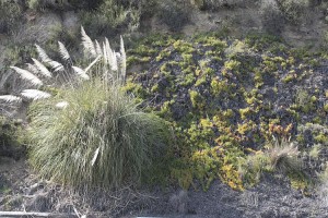
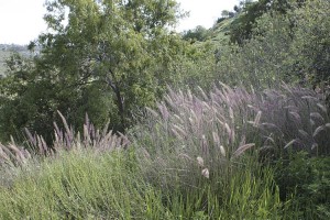
I won’t go into too much detail about this troublesome trio. People have been working hard to get the word out on pampas grass, green fountain grass, and iceplant. The grasses, in particular, can be gorgeous things in gardens, waving in the breeze and lending their dramatic form to groups of softly mounding landscape shrubs. You can see why people want to grow them. But are they garden-worthy in Southern California?

All three of these quickly check out of people’s gardens and make for the wilds. I found both grasses and plenty of iceplant escaped into the canyon, here on this hillside and in other spots. So, as pretty as they can be–and I consider this drift of fountain grass in the second photo to be particularly poetic–these three would be better left in their native lands, or grown in climates where the weather might limit their spread.
tecolote-canyon-wild-onion-flower

tecolote-canyon-wild-onion-plants

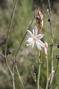
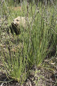
This is the first flower I saw this season on the local plants of onion weed (Asphodelus fistulosus). The first time I saw it I thought it was a wildflower and wanted some for my garden. In full bloom the stalks of white flowers are an impressive sight. But they do spread like crazy. Not a good choice for the garden.
tecolote-canyon-teasel-and-mustard

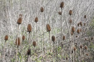
This combination of plants looks as impressive as any planting assembled by practitioners of the New Perennials garden movement. But once again, the plants aren’t really welcome additions to the canyon. In the foreground is teasel (Dipsacus sp.), a plant with excellent year-round architectural structure but having invasive tendencies that are considered “Moderate” by the California Invasive Plant Council (Cal-IPC). Here it’s set against a background of last season’s black mustard, a problem in these parts since it was introduced by the Spanish in the eighteenth century. The Cal-IPC only considers the mustard’s ranginess to be of “Moderate” concern, but also states: “Primarily a weed of disturbed sites, but can be locally a more significant problem in wildlands.” I’d say it’s a more significant pest locally.
tecolote-canyon-fennel

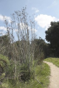
Fennel can be attractive in the herb garden, but like the rest of the invasives in this post, this is another plant that gets around. Its overall undesirable impacts are considered “High” by the Cal-IPC. If I see fennel offered in the local nurseries it’s usually the bronze colored strain. It’s less vigorous, but all forms are considered invasive. I do wish this were a better choice for gardens because it hosts swallowtail butterflies, but at least there’s plenty of swallowtail food out in the local canyons. The butterflies won’t starve. Okay, I’ll pass.
tecolote-canyon-pepper-tree

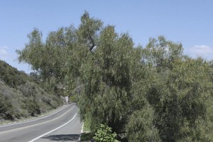
Say “Old California” to anyone who’s lived in these parts for long, and this plant will probably come to mind. The Brazilian Peruvian pepper tree forms a gorgeous tree with long, delicate leaves that move any time there’s a breeze. But unfortunately the plants develop berries that the birds find irresistible. While the Cal-IPC considers their threat to California to be only “Limited,” there are plants that would be better choices.

The Australian peppermint willow (Agonis flexuosa), although not a native plant, is a good drought-tolerant substitute that looks a bit like the pepper tree but doesn’t share its invasive tendencies. If you must have a delicate weeping tree that says “Old California” but don’t mind a lilting Australian accent, this would be a better choice–and you can get varieties with either green or dramatic black foliage. Or you could give up altogether on the colonial look and go in for any of the truly native trees. It doesn’t get any more “old California” than that.

As I reread this post I’m struck that I’m probably not doing a particularly good job of discouraging people from growing these plants. I keep going back to the beautiful redeeming qualities of these invasives, and I guess that’s why they continue to be such a problem. The mind tells you they might be bad news, but sometimes it’s hard to say no.

With this last image I leave the plant kingdom and turn to another species that’s native to the local canyons. This one I think you’ll definitely agree you wouldn’t want around. I won’t assume that you like snakes any more than I do, so if you want to see the picture you’ll have to click HERE.

Still, who among you doesn’t think baby animals are just the cutest things? Now, everybody, say “awwwww”… This is a little baby southern Pacific rattler, probably no longer than my forearm and too young to rattle. I’m deathly afraid of snakes but managed to fend off the fear to snap the picture and watch the snake as it coiled itself defensively and make like a sidewinder, sliding backwards into the grasses.

I have to respect these animals since they do wonders to keep down the rodent population. And they’re every bit as native as the poison oak I showed earlier. But after having had one of these in the backyard facing off against my cat, I’ve definitely decided this is another species that’s not garden-worthy, at least in my enclosed little space.

I admit it, I’m a wimp. Nature isn’t always convenient is it? But throw out the rattlesnakes and pampas grass and black mustard and fennels and you’re still left tens of thousands of cool and friendly selections to invite into the garden.

some garden-worthy local plants

There’s usually a big disconnect between going to a nursery to look at plants and going out botanizing to an open space preserve like the one I live near. The plants in a nursery will likely be the usual garden store suspects, mixed in with new introductions from all over the globe. But what plants you see in the wilds, except for escapees from residential gardens, usually have nothing to do with what you see in the nurseries.

Gardens are of course artificial places. Although people may feel connected to nature while tending their personal landscapes, it’s too often a nature that exists only at their local plant nursery and nowhere in the wild lands around them. My own garden has these same tendencies, but I’ve been trying to counteract them with more native plantings.

Things have also been changing in at least some of the nurseries around town, and there’s a gradual flow of plants from our wild areas into people’s gardens. Most of the larger nurseries offer at least a small selection of natives, and the specialty native plant nurseries can always be counted on for a selection of plants that they feel garden-worthy.

Sunday was cool but sunny, a perfect day for a short walk through my neighborhood canyon preserve to see some of these plants in their wild state. And along the way I saw a couple that I think people wouldn’t mind living with.

tecolote-canyon-sign

Tecolote Canyon–literally “Owl Canyon”–includes a city park of about 900 acres, most of it the slopes and bottoms of a coastal canyon that were too economically challenging to build on. Some of the park has been handed over to a golf course and some athletic fields, but a lot of it remains in something approaching its natural state.

tecolote-canyon-oaks

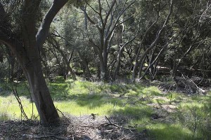
The trail cuts through several stands of our coastal live oaks, shown here with lots of neon green (non-native) grasses. These oaks would be gorgeous in private gardens. Imagining opening the back door and stepping out into this. But a fungus that was imported from Europe in a shipment of rhododendrons is now making these difficult to grow in all but the most driest garden spaces.

tecolote-canyon-water-hole

During the winter rains a little stream runs through the park. It takes months for the water to dry up completely, so every now and then you’ll find little watering holes like this one.

rhus

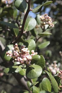
Lemonade berry appears frequently in native garden plantings and is easy to find at native nurseries. The plants have been blooming in the canyon for a couple months, and they’re still blooming. This species forms a large, tidy shrub that stays an attractive dark green color year round. Later in the year it’ll develop orange-to-salmon berries in the place of the flowers. Definitely garden-worthy.

Lemonade berry performs best near the coast where heavy frosts aren’t a concern, but it can come back if frozen.

toyon-berries

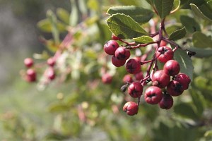
These aren’t flowers, but I think they’re pretty attractive. The toyon, also called Chrsitmas berry (Heteromeles arbutifolia) still had its berries out. This is another plant that makes an attractive large evergreen shrub in the home landscape. The leaves on this are just a little lighter green than those of the lemonade berry, and the plant more densely branched.

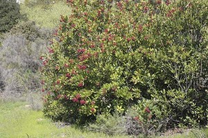
toyon-shrub-2

Toyon is a fine native substitute for holly, bearing these berries during the time of year when holly would. (And speaking of “holly would,” did you know that Hollywood got its name from big stands of this that grew on the hillsides overlooking what’s now tinseltown?) This is also one of the easier plants to find commercially.

milkvetch-closeup

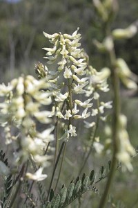
I’ve written recently about a new groundcover milkvetch that I was trying out. A different species with somewhat similar-looking flowers was approaching peak bloom in several spots in the canyon. There are over 1500 vetch species on earth and a half-dozen in the county, but I believe this one is Astragalus trichopodus.

The flowers are small and intricate and appear on a plant that can approach three feet tall. This milkvetch dies back to nothing during the summer drought, but I think it would look great when combined with selections that have more summer interest.

milkvetch-plant

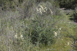
The canyon hillsides are overrun with invasive mustard that is just now starting to put on its spring growth spurt. But this milkvetch gets going quicker, and actually seems to stand a chance against the black mustard menace, unlike other natives that mature later. Here you see it growing up through the trellis of dead mustard stems left over from last year.

tecolote-canyon-lupine

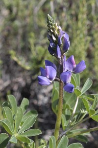
Not having spent much time in Texas, it took me a while to figure out that Texas bluebonnets were Texas species of what I’d been calling lupines all my life. Here’s a “California bluebonnet.” In this canyon they’re more of an occasional treat than a plant that colonizes big spreads of hillside. They’re ephemeral, but would be gorgeous in a garden.

tecolote-canyon-ribes-speciosum

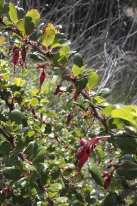
Fuchsia-flowered gooseberry is a shoulder-high shrub with a long blooming period from winter through much of spring. You can probably see from the picture that it is a little on the thorny side, something like you’d see on Victorian moss roses. But the flowers make this a striking plant in the right spot. The shiny green leaves will persist throughout the year if the plant is given an occasional summer sip of water. And did I mention “hummingbird-magnet?”

There were other native plants in bloom, including the perky scarlet monkey flower. But my trip was just a little early to catch the the peak flowering. I’ll post more as I take more trips.

And of course, in a park surrounded by human habitation, you’ll find a healthy sampling exotic species. I’ll post next on a few of my interesting but less garden-worthy encounters.

hanging garden

These are the last of my Chicago tourist architecture photos, all taken on the campus of the Illinois Institute of Technology.

excelon-tube_1

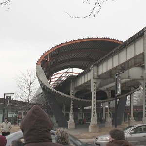
One of the two buildings we looked at in detail is the recently completed Tribune Student Center, which is located directly underneath the elevated rail that cuts through campus. Most architects would have considered the site a disaster and likely would have shied away from the project. Rem Koolhaas, architect of the Seattle Public Library and some other recent high-profile projects, took the location as a challenge and swooped in with a solution so amazing it makes your head spin.

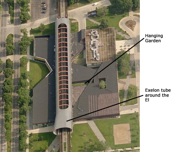
Noise and vibration would be the worst part of living below the tracks. But what would happen if you made a big burrito of the train by wrapping the rail overhead in steel and concrete? And what if you put holes in the top of the tube to direct the noise up to the sky? Here’s a shot of the exterior showing the tube and one side of the student center.

chicago-iit-koolhaas-interior

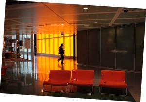
Inside, the center is a busy concentration of colliding lines and angles. And when a train passes overhead, you can still notice it. Only, it sounds more like a home heater turning on instead of a jet taking off.

One little piece of repose inside is what Koolhaas has dubbed the hanging garden. Part bridge, part green roof, this long rectangle planted with grasses brings light inside and introduces some nature into the dark world of industrial surfaces.

Green roofs are by definition on the roof, so you don’t usually get to engage them as directly as you do here. Dropping the roof down like this was almost as brilliant as wrapping the overhead railway in a tube. Unfortunately, this is the only part of the structure that uses anything resembling a green roof.

chicago-iit-koolhaas-hanging-garden-2

chicago-iit-koolhaas-hanging-garden

Here you see the hanging garden hovering over the tables of the cafeteria. It’s a little hard making it out in the picture, but it’s also a little hard teasing apart all the angles when you’re there in real life. This isn’t an architecture that’s all about clarity and purity and minimalism.

mies-portrait_1

mies-portrait_2

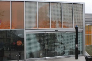
Although it isn’t remotely botanical, I enjoyed this other little detail. An entrance into the student center goes through this big portrait of Ludwig Mies van der Rohe, modern master of clarity and purity and minimalism. To enter on this side, you approach the portrait, the automatic sensor notices your presence, Mies’s mouth opens to let you in, and then proceeds to shut tight behind you to swallow you whole. Yum yum. (I’m not sure Koolhaas thinks highly of Mies’s work…)

Here’s an overhead shot of the whole center, based on the aerial photo at Live Search Maps:

koolhaas

chicago-iit-birches-2

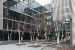
Returning to things definitely botanical, here’s a little planting of birches next door to the Koolhaas building, at Helmut Jahn’s student housing structure. Whether it’s a modern planting like this or a cluster in a residential front yard, there seems to be something about birches that makes people want to plant several of them together. Why is that?

Would a single birch look totally wrong? Would it be asking a single tree to stand in for an entire forest? Is this one of our unquestioned social conventions, or would a single birch simply be too transparent to hold its own? I’ll have to pay more attention next time I run across more birches…

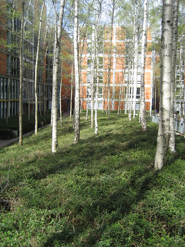
Renzo Piano's Rue de Meaux housing project

While you’re pondering this question, check out the landscaping done at Renzo Piano’s Rue de Meaux public housing project in Paris which uses many oodles of birches in its courtyards. This design doesn’t cluster the trees by twos and threes, but it sure does use a small forest of them. [ Image by lauraknosp via Flikr ]


“drought emergency”

Our Governor has declared a drought emergency for California. The state rainfall and snowpack has been lower than average for most of the recent years, and reservoir reserves are dwindling. My county has been slightly over average in its rainfall this season but most of our water comes from the Sierra snows and the Colorado River. So this crisis is very real for us down here as well.

hang-tag_1At this point we’re on call for a voluntary water reduction, but if the rains fail us people will be required to reduce their water use 20%, and then–if things get worse–by 40% or more. Since landscapes consumes the majority of the water, our county water authority has started an advertising campaign to deliver these water-overuse doorknob hangers with the Sunday paper. It’s also available online: here.

There are checkboxes for “Your sprinklers are watering the pavement,” “Your sprinklers were on during the rain,” “You have a broken sprinkler, and/or your irrigation system is leaking,” “Your sprinklers are on every day” and “Your sprinklers are on during the day.” My local shopping center is a huge offender in the first category and will be getting a hang tag from me.

But this program is mostly about sprinklers and watering habits and doesn’t really address the underlying causes. There really need to be big boxes saying, “Your huge expanse of grass and water-thirsty plants are attractive, but I’d like to show you how you can have a terrific-looking yard that requires almost no additional water,” or “This extremely well-watered golf course has no place in the desert that is San Diego County.”

The very green golf course in the local canyon bottom would get a violation tag if that were the case. At least, to their credit, they let the driving range go brown with the end of the rains. Maybe in California golf could morph into a seasonal winter sport, like skiing? Maybe I’m delusional?

just about to be published

catalog-cover1

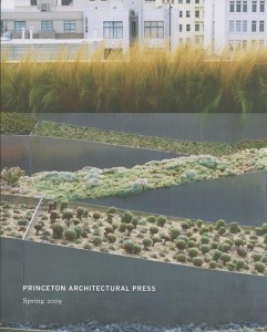
Linda brought by my desk the 2009 Spring catalog of the Princeton Architectural Press. She really like the photo on the cover, a planting by Andrea Cochran, a San Francisco-based landscape architect and the subject of a new book, Andrea Chochran: Landscapes, which is just about to be published. (The project shown is the Ivy Street Roof Terrace Hayes Valley Roof Garden in San Francisco.)

You may recall that Linda is a quilter, and the cover design really looks quilt-like in the way it’s put together: blocks of different plantings (not just blocks of single kinds of plants), all assembled together so that one grouping of plants contrasts dramatically against another, like one patterned fabric in a quilt that’s been set against another. In fact the author of of the book describes Cochan’s work as “studies in repetition and order, orchestrations of movement in the landscape, and elements placed in geometric conversation”–which almost sounds like the principles operating behind many quilts.


Check out Andrea Cochran’s website for other examples of her strong, linear landscape designs.

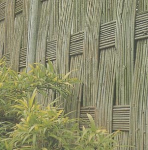
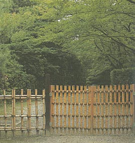
Thumbing through the catalog I ran across another title that made me stop for a closer look, Bamboo Fences, by Isao Yoshikawa and Osamu Suzuki. The catalog says that the book “provides a detailed look at the complex art of bamboo fence design in Japan, presenting these unique structures in over 250 photographs and line drawings. From the widely used ‘four-eyed fence’ (yotsume-gaki) and the fine ‘raincoat fence’ (mino-gaki) to the expensive ‘spicebush fence’ (kuromoji-gaki), these exquisite designs impress with their simple beauty, providing plenty of inspiration for your own bamboo fence.

bamboofence1

“Author Isao Yoshikawa gives a brief overview of the history of bamboo fence building in Japan and classifies the different designs by type. A glossary provides explanation of Japanese fence names and structural terms.”

Of course, fences like this probably wouldn’t work so well if your house is in the Tudor or Spanish taste. Unless of course you want your home to develop a “home store Gothic” look that one writer called the look that suburban houses accrue over time as their owners buy whatever strikes their fancy at the local Home Depot, historical accuracy and style be damned.

bamboofence2

But imagine these around a clean-lined modern house. In fact, Richard Neutra was known to like his glass-walled homes to look out on a Japanese-styled landscape. And some of the more geometric versions might even look amazing behind a landscape designed the the subject of the first book….

bamboofence3

Above: Images from the book, photographed by Osamu Suzuki.