Category Archives: art

plants in black and white

In a world where color photographs are easy to come by it can be refreshing to stand back and look at images where the color has been simplified down to tones of black, white and gray.

Edwin Hale Lincoln (1848–1938) compiled his massive series, Wildflowers of New England, Photographed from Nature, in the early part of the 20th century. The photos are warm-toned platinum prints where the plants form decorative patterns. You can tell that the photographer was associated with the Arts and Crafts movement, and many of the photos could serve as templates for carved decorations on a piece of furniture.

Convolvulus Septium, Hedge Bindweed, Morning-GloryLeft: Edwin Hale Lincoln. Convolvulus Septium, Hedge Bindweed, Morning-Glory, plate 124 from Wildflowers of New England, Photographed from Nature, Volume V, 1904. [ photo from the de Young Museum, which had an exhibition on Lincoln last year ]

Acorus Calamus, Flag-Root, Sweet Flag, Calamus-Root
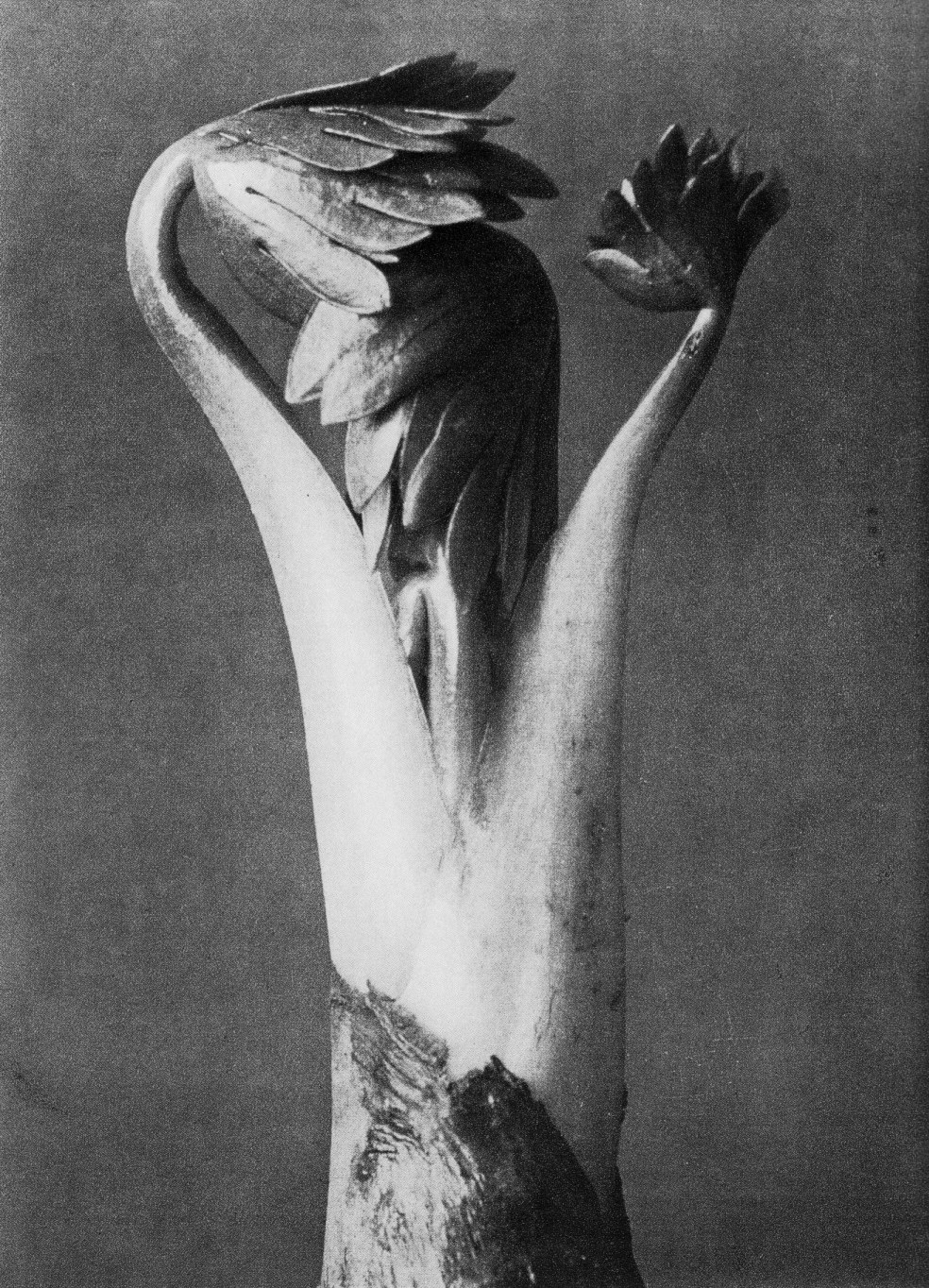
Left: Edwin Hale Lincoln. Acorus Calamus, Flag-Root, Sweet Flag, Calamus-Root, 1914. [ image from Alan Klotz Gallery, which will be featuring Lincoln’s work in a show that runs from May 7th to July 2nd ]

Different from Lincoln’s work are the later photographs of Karl Blossfeldt (1865-1932). His 1928 Urformen der Kunst, published in the 1929 English edition, Art Forms in Nature, features 120 beautifully grainy photogravures. (Soulcatcher Studio has the entire volume online.) Blossfeldt followed up the book with a second volume in 1932.

Blossfeldt, like Lincoln, came out of an arts and crafts orientation, in his case, that of ornamental metalwork. But Blossfeldt moved in closer to his plants, often showing them in extreme magnification. He didn’t claim to be a scientist, and instead was looking at nature for the ultimate inspiration for human art.

(BTW, If you happen upon reruns of the TV show Will and Grace, take a look at Will’s apartment, and you’ll see several framed Blossfeldts prints on the set.)

Blossfeldt closeups

Karl Blossfeldt. Sanguisorba, swallowwort, from Urformen der Kunst, 1928. [ image from the Wikimedia Commons ]

Karl BLossfeldt: Monkshood

Karl Blossfeldt. Monkshood, from Urformen der Kunst, 1928. [ image from the Wikimedia Commons ]

But that’s barely scratching the surface. Check out Edward Weston’s stunning, almost lewd Cabbage Leaf. Or Imogen Cunningham’s Magnolia. Or one of Robert Mapplethorpe’s calla lilies.

Or next time you go out into your garden to photograph a plant, put your camera in black in white mode, and notice the things you start to pay attention to once the color isn’t there as a distraction…

a garden sun-catcher

diane-dandeneau-sculpture

Here’s a sculpture that sits outside the kitchen window. Made out of chunks of colored glass that have been mortared into a steel frame, it’s perky all day long. But when the light casts the perky shadows on the wall behind it, the sculpture turns into a bright celebration of the afternoon sunlight.

John used to work with Diane Dandeneau, the artist who created this sculpture as a prototype for a some outdoor objects she was interested in making.

diane-dandeneau-sculpture-closeup

Where you put a piece of art in the garden is almost as important as the piece you select. Diane’s sculpture is currently set against a greenhouse wall, which is a pretty busy background and doesn’t really do it justice. But until we find the perfect spot, we can still enjoy, either when we’re near it in the garden, or while we’re looking out the window.

gonzo topiary

gonzo-topiary-overview

I posted a couple months ago about the presence here in town of an extreme topiary garden. At that point I hadn’t had a chance to visit it, but last week I finally made it.

gonzo-topiary-section-of-slope

The house responsible for the garden perches high above the street. The owner could have chosen to plant groundcover on the long slope, or to terrace it and garden the different levels. Instead they opted to populate the slope with several dozen crazy little topiaries. Some of them are geometric, but most are fanciful little figures. Bunnies, sea monsters, Texas gunslingers, you name it.

gonzo-topiary-smiling-head

gonzo-topiary-space-alien

The plants making up all the figures appeared to be cape honeysuckle, Tecomaria capensis, a plant that isn’t one of the classic topiary selections. But it accepts shaping really well, and seems to be a good choice for topiary if you don’t mind a little bumpiness here and there. The plant can have spectacular tubular orange flowers, though don’t expect to see many if you’re sculpting a giant bunny out of it.

gonzo-topiary-and-gardener

A spectacle like this doesn’t just happen, so it was no surprise that I found a gardener maintaining it. I was hoping to see someone shaping the topiaries. But instead he was using an electric hedge trimmer to keep the plants off the stairs that led up (and up and up) to the house. But I guess that’s gardening for you. There’s a certain amount of the really gratifying work of putting in new plants or admiring the flowers, but there’s a lot of basic maintenance that goes into it as well…

Speaking of things topiary, I finally had a chance to see A Man Named Pearl, the 2006 documentary on Pearl Fryar’s amazing topiary garden in Bishopville, South Carolina. The basic story is inspiring: a sharecropper’s son moves into a white neighborhood where his presence isn’t appreciated at first; over time he makes a garden that is awarded “Yard of the Month”; and then he goes on to shape a collection of some of the most original topiaries ever clipped. Some of you have seen the documentary already–particularly now that HGTV has broadcast it. But if you haven’t, it’s definitely worth a look.

grab a compass…or a cow

Cow compassesMaybe you saw the news story last August: Using images from Google Earth, Dr. Sabine Begall and her colleagues found that cows generally align themselves north-to-south, using the earth’s magnetic field as a guide. [ image source ]

And you may have heard the followup story this week: Cows grazing around power lines faced in random directions because the electromagnetic fields generated by the power lines disrupted the cows’ internal sensors.

I was curious. If cows can have their internal systems messed with by power lines, what about plants? I did a quick web trawl and found all sorts of evidence that electromagnetic fields could in fact effect plant growth, though bioelectromagnetics is a field that hasn’t seen a huge amount of research.

One study “showed significantly greater wet root weight and significantly smaller stem diameter and dry seed weight at the end of the experiment in exposed plants compared to control plants.”

And I ran across an email response by Shireef Darwish, a grad student at the Department of Plant Science at McGill University, to the question “do magnetic fields have an effect on plant growth?” The explanation is worth reading, and includes an extensive bibliography that points to further effects of electromagnetism on plants.

powerline-road_0001Outofdoors recently did a great post that reminded us that it would make so much more sense to generate power with solar cells at the point of use in the city than to deploy solar arrays in the desert, destroying big swaths of fragile desert.

In addition to eating up the desert, I’d add that remote generation would require the power companies to deliver the power to distant cities, most likely over high tension lines. All of you can probably speak from personal experience that the power line roads that the electric companies gouge through the landscape beneath the lines do plenty to disfigure the landscape and to provide fertile open space that might encourage invasive species. Not a pretty sight. And then there’s the issue of the electromagnetic fields.

It’s been known for a while that a fluorescent tube placed underneath high-tension lines would glow just from the fields. (The effect is observable underneath the lines that carry the hugest amount of current, not necessarily the lower-capacity transmission lines.) There are at least two art projects that take advantage of this phenomenon, both to power the bulbs and to get us thinking about what it might mean for us to have these power lines in our midst.

Fluorescent tubes below power linesLarry and Debby Kline. Encryption (The Electric Fields of California, Site # 4) Sears Point Farming Company
Tubbs Island, Sonoma, CA
[ source ]

I met Larry and Debby Kline here in San Diego during 2003 when they had an opening of their artwork at a gallery across the street from a gallery where I was showing my own work. They were part of the way through this project where they made sculptures of fluorescent tubes beneath some of the high-capacity power lines that run through California. One project used 30 bulbs, another 60. (A tip from the Klines: The bulbs light up best when they’re standing on end.) After assembling the sculptures, they made striking photographs of them.

And then, in 2004, British artist Richard Box used 1301 bulbs in this installation.

Richard Box installation of fluorescent tubes beneath power lines [ source ]

I don’t want to get all hysterical over the potential effects of these electromagnetic fields, but they obviously have some effects on animals and plants. While the power lines may be no more dangerous to your health than your cell phone or microwave oven, I can’t help but think that this is yet another poorly-designed and unnecessary science experiment that we humans have dropped into the landscape. There’s no doubt, though, that at least the power line roads have their impacts.

gbbd: pretty purple

For this Garden Bloggers’ Bloom Day I’ve picked some predominantly purple spring-flowering plants that are starting to do their thing in my garden. All but one of these are California (or Baja California) natives, and all would be seriously water-wise choices for the garden. Some would even make it through an entire summer without water, though they’d look just a little better with a sip once or twice a month.

blue-eyed-grass-closeup

blue-eyed-grass-with-chard-and-heliotrope

Blue-eyed grass (Sisyrinchium bellum): What a great name for a great plant. This iris relative is happy coexisting in a moderately-watered garden with other plants, though they can stand drought. Here they are living alongside some chard and heliotrope.

bluedicks

bluedicks-2

Blue dicks (Dichelostemma capitatum) are common here near the coast and are one of our reliable signs that it’s spring. They self-sow and spread around the garden, but not obnoxiously.

salvia-mellifera

Black sage (Salvia mellifera) is one of the local canyon plants that’s earned a place in the garden. In life the flowers are a slightly stronger pale mauve color than here in the photo. It’s just beginning to come into flower and should be a little more intense in a couple weeks. Though not one of the “look at me” sages, it’s still quietly beautiful.

verbena-lilacina

verbena-lilacina-2

Verbena lilacina originates in Baja. The plant shown here is just getting started. It should flower much of the year and require very little summer water.

morea-tripetala

This one’s maybe closer to blue than purple, the South African bulb Morea tripetala. I stuck it in a really dry spot, and it’s now probably just blooming on the reserves in the bulb. We’ll see how well it does after a season of tough love in the garden.

penstemon-margarita

And with the last photo we come back to California with the justifiably ever-popular Penstemon Margarita BOP (sometimes sold as Penstemon heterophyllus ‘Margarita BOP’). The flowers are a wild mix of blue and magenta pink, giving the overall impression of purple. The open tubular flowers have something of the look of a foxglove which would require a certain amount of water, but this penstemon actually does just fine with almost no added water.

Thanks to May Dreams Gardens for hosting Garden Bloggers’ Bloom Day. Check out the page with glimpses into what’s blooming all around the world.

hot lips

I’ve heard salvia connoisseurs talk down about this plant, Salvia microphylla ‘Hot Lips,’ mostly because it’s getting to be so commonly available in areas where it grows easily. But of all the sages in my garden this one has been the best performer.

Living in a sunny spot with dry-to-average garden water, the plants are covered with these flowers year-round, hitting a peak in the fall.

salvia-hot-lips-grid

Common or not, the flowers make the plant really interesting. Most are two colors, a combination of scarlet and white, with no two flowers exactly alike. But often you’ll get flowers that are almost all white or all red. I’ve heard that cold weather seems to bring out the white, and that syncs up with what I’ve seen. But at the same time you’ll often still have multi-colored flowers–all on the same plant.

The growth habit is like a lot of sages, meaning the plant has the lines of a chocolate truffle left on a warm dashboard. For me, so far it grows about 30 inches tall by 60 wide. It’s supposedly hardy down around 20 degrees, but don’t expect many flowers when the frost starts up.

If you can grow it, this could be a good candidate for your list!

blog typography

In response to my post on the interesting typography of the J.L. Hudson seed catalog, Philip wondered whether it would be possible to design a blog so that it would look like an older publication that was typeset without the aid of computers.

There are lots of blog design elements, but one of the most important is the main text that people read. Here are a couple attempts at coming up with an online typographic style that looks a little more oldschool, more pre-computer.

Lorem ipsum dolor sit amet, consectetur adipisicing elit, sed do eiusmod tempor incididunt ut labore et dolore magna aliqua. Ut enim ad minim veniam, quis nostrud exercitation ullamco laboris nisi ut aliquip ex ea commodo consequat. Duis aute irure dolor in reprehenderit in voluptate velit esse cillum dolore eu fugiat nulla pariatur. Excepteur sint occaecat cupidatat non proident, sunt in culpa qui officia deserunt mollit anim id est laborum.

Lorem ipsum dolor sit amet, consectetur adipisicing elit, sed do eiusmod tempor incididunt ut labore et dolore magna aliqua. Ut enim ad minim veniam, quis nostrud exercitation ullamco laboris nisi ut aliquip ex ea commodo consequat. Duis aute irure dolor in reprehenderit in voluptate velit esse cillum dolore eu fugiat nulla pariatur. Excepteur sint occaecat cupidatat non proident, sunt in culpa qui officia deserunt mollit anim id est laborum.

So do they look on the right track?

This is a greatly condensed version of a much more technical post. Click “continue reading” below to see the full version.
Continue reading blog typography

visualize your blog content

A lot of blogs these days–including this one–have tag clouds in their sidebars. These highly visual displays of tags the blogger has supplied give you a good sense of the kinds of topics the blog covers. And they give you a sense of how often the topics get discussed.

These do a nice job of displaying the words the blogger thought would be important, but they sometimes miss the big picture that you could get by turning an entire post into a cloud, something using all the words in the post, not just the ones supplied by the blogger.

One of the interesting things I saw in the coverage of Barack Obama’s inauguration was an Associated Press visualization of his inaugural address using an online tool to analyze the frequency of the words he used. (Perhaps the AP’s analysis was based on one at Free Government Information.) Then the story went on to compare it with a visualized version of George Bush’s 2005 inaugural address.

I used the same tool, TagCrowd, to re-visualize the same Obama speech. TagCrowd picks the most frequently used words and assigns different sizes to them. As in a regular tag cloud, the bigger the visualized word, the more times it was used.

obamaspeech

But instead of comparing it to Bush’s address, I visualized Lincoln’s Gettysburg address, since people seem to compare Obama and Lincoln. You can see how language has shifted over one and a half centuries, as well as how differently the men use words.

lincolnspeech

Interesting, huh?

Then I thought, why not try visualizing some blog posts by turning all the words in blog posts into clouds? Would the results between posts be that different? And would they differ much from the tag cloud in my left sidebar?

The first posting I analyzed is a recent one, “greener gardening practices,” from January 7:

blogpostinggreener

How would that gardening post compare with one of my older hoity-toity art posts? This is the cloud derived from “gardens, phonebooths, poetics and old maids,” a post from January 21, 2008:

blogpostchiricahua

Pretty different clouds, I thought. (And sorry for the typos on “Cochise!”) The different subjects resulted in dramatically different vocabularies and different word emphases. Also, over the last year, I’ve been trying to simplify my writing for the web–not at all dumbing it down, but adapting to how people read text on a screen versus text in a book. That probably contributed to a difference between the two posts.

Try TagCrowd. Compare old posts with new posts, or posts about your garden with those about your friends or travels. Or pick just one text you like to see what the repeated words tell you.

I think you’ll discover some interesting things!

talking trees

If a tree talks in the woods and no one’s around to hear it, does it make a sound?

Tuesday morning I had my choice of places to view the televised inauguration of Barack Obama or ways to hear the audio feed. Working as I do on the UCSD campus, there were rooms in libraries, radios at coffee stands and individual laptops that were all playing the ceremonies. The most unusual venue I could pick from was to hear the inauguration broadcast through the speakers of lead-plated eucalyptus trees that were installed over twenty years ago as part of the campus’s Stuart Collection.

treesingingLeft: The tree in the installation that plays music.

The work is Trees by artist Terry Allen, and was constructed from three eucalyptus that either had died or had to be removed to make way for new construction. The dead trees were cut into big chunks, dipped in wood preservative, reassembled, and then covered with small sheets of lead attached nails. What was the artist’s intent? The Stuart Collection’s description offers this explanation:

One could walk through the grove several times before noticing Allen’s two unobtrusive trees.  Not only do these trees reinvest a natural site with a literal sense of magic but they implicitly make connections between nature and death and the life of the spirit.  It is not surprising that students have dubbed this area the “Enchanted Forest.”

At the entrance to the vast, geometric library the third tree of Allen’s installation remains silent – perhaps another form of the tree of knowledge, perhaps a reminder that trees must be cut down to print books and build buildings, perhaps a dance form, or perhaps noting that one can acquire knowledge both through observation of nature and through research.

treetalkingfrombelowRight: The tree in the installation that recites poetry.

On Tuesday, the tree that ordinarily recites poetry and the one that typically offers songs and music were dedicated to an audio feed of the Presidential inauguration. The organizers had high hopes, predicting “hundreds of students” would show up for the event. But for the few minutes I could spend there, I counted just about a dozen people and two dogs (well-behaved ones, attending with their owners, not dogs doing their thing on the trees…).

treemutebarkLeft: The “bark” on the mute tree, showing the nails holding the lead plates, as well as the list of credits of the people who worked on the project.

treemuteLeft: The mute tree, as seen from the library entrance.

The special programming wasn’t the easiest sell that morning. The inauguration was already a huge event.

I’ll have to admit I had a hard time paying attention the the art event myself. You could feel change in the air. And even talking trees in a forest weren’t enough to get people to stop.