Category Archives: art

they’re everywhere

So there I was, a couple years ago, walking the quiet galleries of the San Diego Museum of Contemporary Art, when I encountered this patch of urban decrepitude:

Weeds! Growing in the cracks between the walls and floors!

Suda_Weeds_Overview

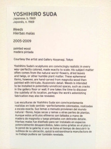
Well, of course, the domain of botany is usually outside the museum walls, and what you’re seeing is an art piece by Yoshihiro Suda. Each of these itty bitty little growths is actually a miniscule piece of sculpture, carved out of wood and then painted to resemble plant-life.

Suda_Weeds_At floor level

Fun, yes, but if it’s a wet wintertime in Southern California—ack!–you’ve already seen all the weeds a sane human should be expected to endure. But hey, this is art. Calm down, I told myself. As much as I wanted to do it, I resisted my natural urge to pluck the little green monstrosities and introduce them to the lifecycle of compost.

Suda_Weeds_Sign

And then I start wondering. These don’t look like the typical weed species in my garden. Are these examples of the weed species the artist encounters in Japan? Or is there artistic license being exercised here?

But whatever species they are, it’s clear that these plants aren’t meant to be there, that these are weeds. To a gardener, some things are universal.

Suda_Weeds_Alt overview

garden signs of the times

Part of this weekend’s tasks was to help install signage at a couple of the gardens that will be on the Garden Native garden tour this weekend. How many times have you gone to a garden and seen the perfect plant, but you no have idea what it is and there’s nobody around to ask? That’s exactly the scenario the organizers are trying to avoid.

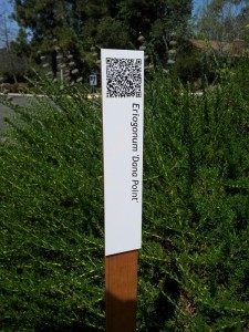
One of the tour signs, with a QR code at the top that leads you to a page with information about the plant

The signs have the name of the plant, but they also have this little handy QR code at the top. When you read the QR code with a smart phone you’re transported to a PDF with more information–and usually, photos–of the plant, with notes on things like the plant’s eventual size, its water needs and often with notes on how to use it in the garden. These PDF files are downloaded to the user’s device, so they can have a record of what they’ve viewed. Unless your cell phone reception is really poor or you have a limited data plan–or have no smart phone at all–this arrangement works really well.

A sign for a buckwheat, and a signed San Diego sunflower

Who wouldn’t want to know the name of the perky yellow San Diego sunflower in the distance?

Out to pasture...
Out to pasture…

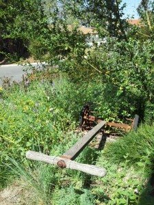
Of course not everything requires a sign. If you have an old lawnmower, but have native plants instead of a lawn, what do you do? How about making some garden art out of the old lawnmower? Brilliant.

It’s interesting to see how many uses these QR codes are being put to. They’re used all over for advertizing. And you’re starting to see them more frequently on interpretive signage, like here. I wasn’t responsible for making these signs, but even I haven’t been immune to using QR codes. In my case they’ve appeared in some artwork of the last couple of years.

Here’s a short video of a temporary installation I had up at the San Diego International Airport from May to December of last year. It’s simply titled Twenty-Two Flags. Each of the 22 flags has 33 QR codes, each with fragments of text from the Bardo Thodol, the Tibetan Book of the Dead, a book I’ve described elsewhere as a Fodor’s Guide to reincarnation and the afterlife.

Twenty-Two Flags (Bardo Thodol), 2014 from James SOE NYUN on Vimeo.

Add up all 22 flags and 660 QR codes and you have the entirety of the two books that make up this first-millennium text. Unlike the garden signs, the codes in my piece link directly to the text and don’t rely on using the web to connect to more content. Each QR code can be asked to store over 1200 different characters. That’s a lot of text!

The piece was part of a show looking at the art/science/tech interface. Something appealed to me about encoding a fairly ancient text that’s endured through the years using a very contemporary and most likely to be short-lived technology. In the end you can call me a bit of a Luddite. I love tech, but I don’t really entirely trust it. Give me a handwritten note, a letterpress book–or a plant. Those things I can trust.

native plant-themed fabric and giftwrap

I’ve been playing.

In the darkness of late December I started to think about spring and the plants and flowers that were just a few months away. I’d recently started spending some time at the Spoonflower site where you can upload your own designs for fabric, wallpaper, giftwrap and decal. What kinds of patterns could I make out of my old photos of California native plants?

Here are a few I came up with, and there are a few variants up at eventually I’ll add a few more as time and life permit.

I’ve put these designs up at a little storefront at the Spoonflower site. The cost of these one-off custom prints is steep compared to paper and fabric produced in quantity overseas, but you’re welcome to use these designs if you’d like to make a special pillow or wrap up a special package. And if you do that Spoonflower sends me a little kickback that I can apply to future design and printing projects.

California Bush Anemone (Carpenteria californica) on Periwinkle
California Bush Anemone-Modern on Periwinkle

California Bush Anemone (Carpenteria californica) on Black
California Bush Anemone-Modern on Black

Hummingbird Sage (Salvia spathacea), version 1
Hummingbird Sage-Monochrome on Yellow

Hummingbird Sage (Salvia spathacea), version 2
Hummingbird Sage-Natural Colors on Magenta Pink

Fort Miller Clarkia (Clarkia williamsonii)
Fort Miller Clarkia

Chalk Dudleya (Dudleya pulverulenta), Medium Size–Sepia
Chalk dudleya-Medium size, sepia

Chalk Dudleya (Dudleya pulverulenta), Big Print, Graphic and Gray
Chalk dudleya-Big print, graphic and gray

Chalk Dudleya (Dudleya pulverulenta), Big Print, Natural Colors
Chalk dudleya-Big print, natural


unbearably cute

The piece, with a truck added for scale

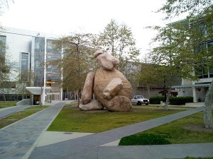
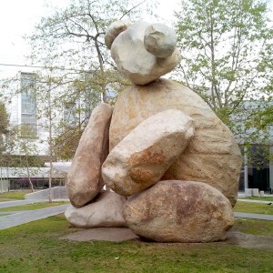
Here’s a fun artwork from the Stuart Collection at UCSD, Tim Hawkinson’s Bear. At almost 24 feet tall and 180 tons it’s a little bigger and heavier than your average Steiff bear, but it’s gotta be at least as cute.

It’s a pretty simple idea: take eight big to really big boulders and pile them together, just so. There’s a fair amount of engineering that keeps the piece from falling apart, but all the tech stays in the background. Nothing intrudes into the piece’s overscaled cuteness and child-like sense that anyone could assemble a few rocks together like this.

A portrait from closer up. Awwwww......Cuuuuuuuute.....
A portrait from closer up. Awwwww……Cuuuuuuuute…..

In our stats-obsessed world people will compare the piece’s “mere” 180 tons to the 340 ton mass of the monster rock that achieved superstar status as it got transported into downtown Los Angeles to become the central element in Michael Heizer’s Levitated Mass at the LA County Museum of Art. (You can read about the piece–and the rock–lots of places, including [ here ] on fellow blogger Ryan’s Dry Stone Gardening.) But, hey, 180 tons is already double the weight of a space shuttle, so I’ll allow myself to be impressed.

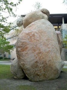
Actually this, the back, is my favorite angle on the Bear

The stone comes from a quarry up in Pala, in the foothills about an hour to the northwest. It looks a lot like the boulders of our backcountry: smooth-surfaced, light-colored, with a warm rosy orange glow. A geologist once told me that at least some of the stone that makes up some of the adjacent formations is quartz monzonite, a felspar-rich mineral adjacent to granite on a family tree of plutonic rocks. But whatever it’s made out of, granite, quartz monzonite, it’s cool to have a big pile of big rocks from East County, remixed into a giant bear.

But one thing keeps bugging me about the work. The campus mascot of UC Berkeley, Cal, is the bear, and I keep wondering whether the artist got it wrong and thought that all the UC campuses had the same mascot. (San Diego’s is–lamentably–the tritons. Lame, but at least not insulting to many members of the population.) If this piece were transported to that northern campus I think it’d be an instant pet artwork and a big hit. So I keep wondering whether this site-specific artwork ended up at the wrong site. Very cute, but also very lost.

there be dragons

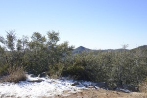
Mt Laguna snowIt had snowed in the local mountains late last month. By the time I got up there you could still find big patches of snow on the ground.

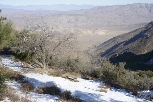
Snow over the desert

At the crest of the Laguna Mountains you can look down down down over the edge of the escarpment of the Elsinore Fault to the Vallecito Valley immediately below. It’s a quick vertical mile of dropoff, a height comparable to many vistas along the Grand Canyon. The change in elevation is impressive, but so is the radical change in landscape. A fairly well-watered green-and-brown mountain plant community–think pines, ceanothus, mountain mahogany–careens into a sere desert landscape, all of it in muted brown and purple and pink and gray tones. Down below the colors of geology quickly overpower those of biology. Someone who doesn’t love deserts might liken the descent into Anza Borreo Desert State Park as a descent into Hell.

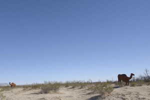
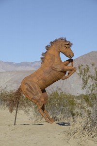
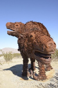
On this early January day Hell was pleasant, in the low 70s, sunny and dry. Something I hadn’t visited before was a big installation of sculptures by Ricardo Breceda. Installed on a flat expanse on the edge of Borrego Springs you’ll find a rusty steel menagerie of various creatures. I recognized the camels and horses, including this horse with an unfortunately-placed support column.

Camel scuptures in the desert

Horse with rectal probe

Archduke Charles sculpture
(Note to artist: It is possible to model rearing horses without rectal probes, as this sculpture of Archduke Charles in Vienna’s Heldenplatz shows. (Photo by Peter Gerstbach and used here by the terms of the GNU Free Documentation License.))

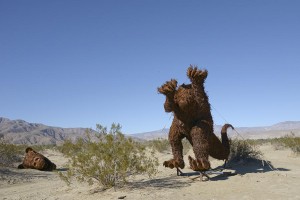
I recognized some of the creatures but a few started to get pretty fanciful, like they’d escaped from a Maurice Sendak picturebook.

Beheaded beast

This one had either just lost its head or was still in the process of being installed.

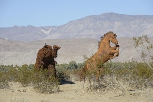
Horse escaping creature

Headless or not, it was scaring the horses…

Ricardo Breceda sculpture creature

And what the heck is this creature supposed to be? Whatever it was, it appeared to be mom with a little one on her back.

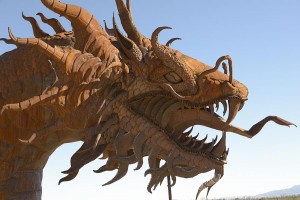
Dragon head

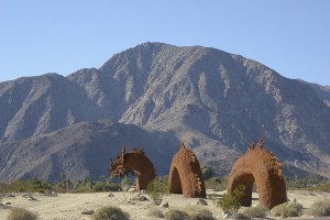
Dragon with mountains

And now we come to the dragon, a big and fancy and fearsome number with five different segments that go from one side of the road to the other. (Edit January 20: Ricki points out that it’s probably a sea serpent and not a dragon, and I agree with her.)

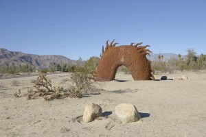
Dragon segment as gate

Here one of the segments functioned as a really lovely little garden portal.

Dragaon vs cholla

But in the end the most fearsome thing of all out in the desert that day wasn’t the dragon, but this “jumping” cholla cactus, one of the local Cylindropuntia species (maybe C. ganderi?). I’ve never been hurt by a dragon, but this bit of botanical evil is a different story. Be afraid, be very afraid.

sunburn–the good kind

Until a couple weeks ago I hadn’t bought any art or photo books this year. In today’s online age something really has to speak to me for me to want to make space for it at home in tangible, doorstop form. Chris McCaw’s new–and first–book, Sunburn, was the release that broke this year’s bookless streak.

Sunburn book cover
Sunburn / Chris McCaw.
Richmond, VA: Candela, 2012.
Dimensions: 10 1/2 x 11 1/2 in.
96 pages, 43 plates
ISBN 978-0-9845739-2-9

From cover to cover this is a book of photographs incorporating one main subject: the sun. But this is the sun photographed in a way that’s never been done before.

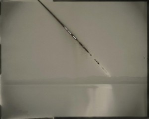
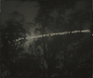
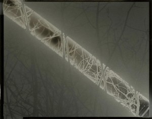
Chris uses giant lenses, many of them weighing dozens of pounds, and aims them at a sheet of vintage photo paper inside big cameras of his own making. All that light generates a lot of heat, and the paper inside the camera often scorches the areas where the sun’s image falls on it. Most of the exposures are many minutes to many hours long, so that as the sun moves through the sky it burns lines and arcs onto the paper in the camera. Sometimes little fires break. Photo paper isn’t used to all this light, and in addition to flaming out every now and then it can do some wacky things with a process called solarization, where some parts of the image are flipped from negative to positive. In a few of the images you can also see some rich colors others than black or white or gray in the danger zone around the sun’s image, a reaction of the paper’s chemistry to being used in ways it wasn’t designed to be used. (The book’s cover image above demonstrates this nicely.)

The method of working would remain an interesting anecdote if it didn’t result in some pretty startling photographs. Be sure to click and enlarge these images to begin to see all their beautiful little subtleties. You’ll be glad you did.

Chris McCaw Sunburn Number 65 (Nevada)

Chris McCaw. Sunburned GSP#65 (Nevada), 2007. 16″x20″ unique gelatin silver paper negative. Private collection.

This early piece shows the classic burn-through with the sun’s path.

ChrisMcCawSunburnNo190

Chris McCaw. Sunburned GSP#190, 2008. 20″x24″ unique gelatin silver paper negative. Fidelity Investments Collection.

In this and the next image the sun didn’t scorch through the paper, but it did some cool things with the branches in the foreground.

Chris McCaw Sunburn 325

Chris McCaw. Sunburned GSP#325, 2009. 4″x5″ unique gelatin silver paper negative. Private collection.

Some photography concerns itself with the world outside the camera. It’s photography about people, places, issues and ideas. Other kinds of photography do a lot of navel-gazing obsessing about the process of photography itself. This second camp expresses itself in lots of different ways, including images produced using antique photographic processes, toy cameras, camera-less photograms, or images created by the chemical reaction of the entrails of bunnies with color photographic paper. (No, I’m not making this up. The photographer Adam Fuss has a body of work that apparently ended up with his family and friends eating many meals that featured rabbit as the main course.) I think Chris’s work falls a little more on the camera-geek side of the equation, and his work is instantly appealing to photographers familiar with the materials he works with. But the resulting photos of landscape with a sun’s path burned out of the sky, with mysterious flips of positive and negative, dark and light, are pretty wonderful things that viewers attuned to beautiful objects will immediately connect with.

ChrisMcCawSunburnNo541Galapagos

Chris McCaw. Sunburned GSP#541(Galápagos), 2012. 8″x10″ unique gelatin silver paper negative.

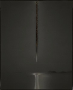
The sun’s path changes with the seasons and with your location on the earth. If you want to have your sun rise up the center of the photo in a perfectly straight line you have to do some traveling to the earth’s equator, which is exactly what Chris did, taking this photo off the coast of the Galápagos Islands earlier this year. Wow, huh? The sun’s reflection really makes this image.

And there’s a sort of companion piece to this one, a big multi-panel panorama he shot up in Alaska’s Brooks Range, where the sun never sets as it marks a long, slow parabola over the mountains on the horizon over the course of more than a day. Double wow. (It’s on pages 68-69 of his book.)

And did I mention Chris is a really cool guy? A few years back I was on a little desert camping trip to Anza Borrego with four other photographers, and Chris was one of them. At that point he’d figured out that there was something really interesting when you burn a photographic negative, but hadn’t yet worked out his current method that uses big sheets of photographic paper that serve as the final artwork, scorch marks and all. To think, I knew the Chris way back when before impending greatness.

So…if you have a big, rectangular stocking to fill later this month, this might be the perfect thing to put in it!

ChrisMcCawFrontispiece

Oh, and I forgot to mention this impressive frontispiece to the book. The image is Sunburned GSP#573(eclipse), 2012. Cool enough, but the page has been die-cut to give you a sense of how it would be to handle one of these photos. I didn’t shoot the back of the page, but there you’ll find reproduced the backside of the image with scorch marks and Chris’s notations. It’s for things like this that the word-elves invented the word “awesome.”

All images in this post are copyright the artist, and are used here with his permission.

tales of the city, and a room of mirrors

After leaving Yosemite we took a whirlwind trip to the Bay Area. We had tickets to see Robert Wilson’s and Philip Glass’ “opera,” Einstein on the Beach, which was staged at UC Berkeley as part of an international tour. I’d known the work since it shook the new music and theater circles in the 1970s, but West Coasters like me haven’t have a chance to see the work until now.

It’s a piece that has to be seen to be really appreciated, but I’ll give you a one-word review: Wow.

(Curtain calls…)

So, while in the neighborhood, we cross the bridge to San Francisco for a quick day of even more culture.

With so many offerings you have to choose. This is the sun hitting the famous green roof of the California Academy of Sciences. We didn’t have time to go inside…

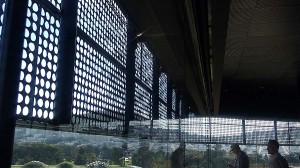
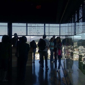
…but we did get a good overall view from the view tower next door at the de Young Museum which was renovated fairly recently. Architects Herzog & de Meuron clad the building in an amazing mantle of copper and added a multi-story tower capped off with a rhombus-shaped viewing chamber.

The odd angles and walls of glass made for a glimpse of what it must be like to live inside a kaleidoscope. The views were great, but the reflections inside the viewing chamber were at least as amazing.

Even the floors were polished and reflective.

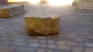
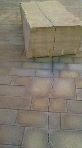
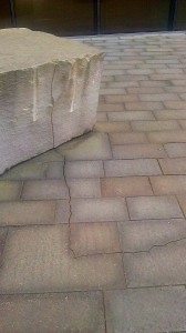
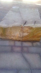
The entrance to the de Young features a charismatic piece by Andy Goldsworthy that’s been written up many times by bloggers and journalists. How can you not like a big installation of oversized cut stones and pavers that nods to California’s seismic origins by featuring a delicate but assertive crack that travels all throughout the entry plaza where the piece is installed? You can click this little panorama to the left and see the line exit one of the big stones and end at the museum’s front door.

And below are some of the cleaved stones. It’s easy to miss the little crack at first, but when you start to follow it around the courtyard the piece really comes to life.

Wow, all over again.


from the art fair

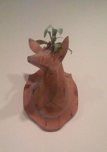
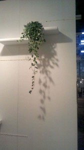
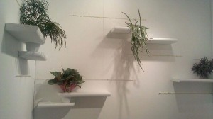
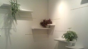
I just popped over to the Art San Diego 2012 contemporary art fair, which runs through Sunday. In addition to art, there was a lot of interesting design. A couple of the pieces or installations employed live plants and I thought I’d share them here.

The first photos are of a wall piece. I wouldn’t be surprised if the idea of planting a staghorn fern in the head of a stag trophy has been done already, but I thought this was fun. Unfortunately the presentation was short on labels or further information, so the exhibitor missed out on an opportunity to get free publicity on a garden blog that must get readers by the millions.

The other was this art installation by local artist Keenan Hartsten, who works with various natural materials. Making up this piece are plants, pots, the horizontal shelves–whatever they’re made of–and white and colored pebbles that have been glued to the wall to form horizontal lines. In this gallery-like context the plants look extremely strange, even though many of them are fairly common houseplants. If I were uncharitable I might say that the plants looked more artistic and wildly strange than much of the art in the rest of the fair. But being a plant person quite frankly I find that’s generally the case: Most plants are far more interesting than most art.

You can see some of Keenan Hartsten’s other works at his website [ here ]. I Especially like the driftwood piece he did for a local surf shop.

visiting the fallen star

Last year I showed you some of the construction leading up to the installation of Fallen Star, this art installation by Korean artist Do Ho Suh. Basically it’s a tiny Providence, Rhode Island-style house and garden that has improbably landed on the edge of one of the engineering buildings at UCSD. The “landing” was a little rough, as you can see, so that the floor of the house is a few degrees off of level. The walls of the little house aren’t quite plumb, either–and don’t quite match the angle of the floor. The whole effect is pretty disorienting.

(You can click [ here ] to see all the other post I’ve done on this installation.)

Aside from creating an intriguing object set helplessly among the brutish concrete structures around, the artist is using the sense of disorientation to conjure up the sense of disorientation he felt when he came to this country to study at RISD. But in addition to the disorientation, he’s also interested in creating an oddly sheltering space. We find community wherever we can, even in the most unlikely places, in this case seven stories off the ground, jutting out alarmingly over the quad below.


I tried to visit on the first day the piece was open to the public. The crowd was way crazy, and it was like trying to view art at a gallery opening. Definitely not the best time.
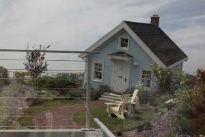
So, when I got a chance to see it under much more civilized circumstances I jumped–no, let’s use a different verb: I went for it.

So…we approach the house from the adjacent building. The safety railing is perpendicular to gravity. As I’ve mentioned already, the house is not.

This is me, stepping into the slightly under-scaled, seriously slanted interior of the little house.

Most visitors’ first reactions will be to the off-kilter feeling of seeing the positions of house and furnishings not quite lining up with what your inner ear is telling you you should be seeing. The little chandelier in this photo is pretty much the only thing acknowledging gravity.
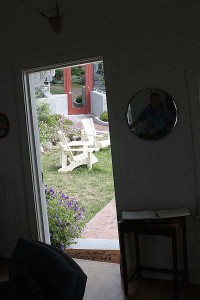
Looking out the door towards the house’s perch, you can get a really good sense of the crookedness.

Here’s the rest of my little group inside, next to the fireplace. After a few minutes you really start to feel queasy.
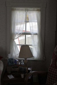
Once you get over the shock of the fun-house aspects of the piece you start to notice little touches: family photos, tchotchkes, lucid details that inhabit everyday life and memory. The inhabitant of the house is fictional, but you think that your Aunt Edith or Gramma Olive might have been models for her.
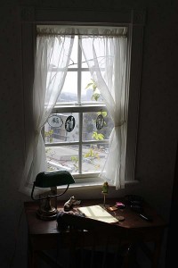
I thought the little views out the windows were especially poignant.
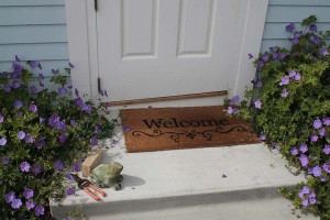
Just outside the house you sense that whoever lives here might just be a gardener. Who else would leave a concrete frog and Corona clippers right at the front door?

If the clippers weren’t enough of a clue, how about a bright green garden hose? Some people do their best to hide away their hose, but the kind of gardener who lives here would have nothing to do with all that silly fakery.

Outside gravity reigns. The plants know which way is up, and by this point you might need to sit down and remind yourself.


There are lots of ornamentals outside. The gentle yellow of this sunflowers looks great against the house’s clapboard exterior.

Morning glories were clearly enjoying their full sun exposure, even though this is about as exposed a spot for garden that you’ll find anywhere. In case you’re dying for the name of this variety–like I was–it’s the heirloom Carnevale di Venezia.
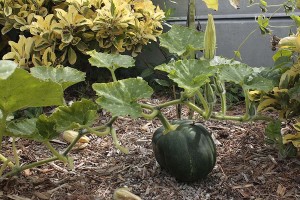
Grandma’s Olive’s fictional double also enjoys her summer vegetables. This is a brown pumpkin…
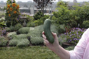
…and here’s a perfect Persian cucumber, a gift to me from the garden of the Fallen Star.

A perfect conclusion to an amazing tour.

music in the garden

Painting: Giverny revisted
Raisy Derzie. Giverny Revisted.

None of us live by gardening alone. Lately I’ve been going back to some of my earlier days, composing music. If you’ll be anywhere near Long Island later in July I invite you to a performance that’ll include one of my new pieces, Afterimages, for clarinet and cello, composed for Thomas Piercy (clarinet) and Suzanne Mueller (cello).

There is a gardening tie to all this: the premiere will take place at the Old Westbury Gardens as part of the Sunday Afternoon Concert Series. The date is July 22, and the concert will commence at 3 p.m.

The New York new music organization Vox Novus invited composers to write something in reaction to this painting, Giverny Revisited, by Raisy Derzie. And, oh yes, the piece had to be sixty seconds long or shorter–talk about a big limitation! They then picked fifteen of the submissions for their ongoing Fifteen Minutes of Fame series of concerts, and my piece will be one of them. In keeping with the idea of the painting, where the artist has taken up the subject matter of Monet’s garden through a modern lens, my piece uses contemporary harmonies and rhythms to riff on the opening of Reflets dan l’eau, the first piece of Claude Debussy’s first set of Images for piano.

Southern view of Phipps estate

Also on the program will be pieces by all sorts of composers from Leopold Mozart, Beethoven, and Bartok to Charlie Chaplin. Cool music, all performed on the very manicured grounds of the old John S. Phipps estate on Long Island in New York.

I had another short short work selected for another of Vox Novus’ concerts, this one featuring the West Point Wind Quintet in a concert designed to commemorate the 150th anniversary of the Civil War. I was feeling a little contrary, so not only did they get a piece less than a minute long, the piece was a three-movement suite, all of which clocked in at about 54 seconds. It’s all a little square and academic but it was fun to write.
The piece: Field Notes: Three Volleys for Wind Quintet

The movements (linked to the YouTube performance):

[ Program notes to the whole concert, including videos of the concert, in two parts ]

The entire world premiere performance on April 29, 2012:

Enjoy!