Tag Archives: architecture

piece o’ history

Here’s the latest addition to the garden, a small chunk of the House of Hospitality in Balboa Park, a small chunk of San Diego architectural history.

In the late 1990s the city rehabilitated the building, one of many historic structures built as temporary exhibition spaces for the 1915 Panama-PacificCalifornia Exposition. The exhibit halls weren’t really intended to be a landmarks to pass into time immemorial. But the city has grown attached to these examples of Churrigueresque architecture, and the buildings are actively preserved.

(“Churrigueresque” refers to the Spanish/Catalan architect José Benito de Churriguera, who developed a fairly elaborate Rococo style of ornament that was picked up in Colonial Mexico. Bertram Goodhue and Carleton M. Winslow, the architects who worked on the Exposition, studied the style in Mexico and brought it a few miles north of the border. The over-the-top plaster details made for dramatic and escapist exposition buildings, but the details are high maintenance and can begin to fail over the years. It got to the point that the ornamentation was falling off the buildings and threatening to ka-bonk passers-by.)

“Preservation” of the building went through several phases, and eventually employed the wrecking ball. The old House of Hospitality was demolished and a new one erected in its place. To make sure that the new building closely resembled the original the old ornamentation was removed from the buildings and casts made. The new ornamentation is now made of glass-fiber-reinforced-concrete instead of the original horsehair-reinforced plaster.

Rather than landfilling the old architectural ornamentation, the interesting chunks were sold off to benefit the preservation efforts. And it was on a frantic Saturday morning in 1997 where we were able to fight off some of the most aggressive shoppers I’ve ever encountered to pick up this piece of local history. I’m pretty sure that my chunk of history comes from the tower in the photo above, from around the arches.

The fragment was really cool, but it sat in various corners of the house and my studio as we decided what to do with it. Last month we finally decided to liberate the piece back to the outdoors. Here’s its probably final resting place, attached to a long blank stretch of fence above the fishpond.

I don’t typically go in for lots of garden art or pieces of fake Roman artifacts sprinkled around a garden. But I was happy with how this relatively small chunk of Balboa Park serves as a cool focal point for a part of the garden presided over by a long, plain fence.

In demolishing the original building and dispersing its surfaces the city has managed an odd sort of preservation. Zoos and botanical gardens sometimes have the sad burden of keeping alive species that no longer exist in the wild. And my back yard holds a piece of a building that exists only in a facsimile of the original.

a visit to the l.a. county museum

Another quick stop over the holidays took the form of a visit to the Los Angeles County Museum of Art.

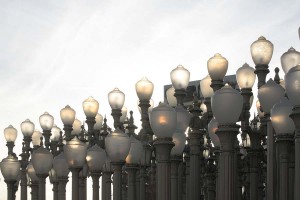
Installed at the new main entrance is this battalion of 202 antique streetlights, Urban Light, by artist Chris Burden. Streetlights like these of course were positioned at curbs in straight lines, spaced regularly. Clustering them together like this accentuates that fact, and to me makes the whole installation seem maybe just a little bit militaristic.

Arranged behind the Burden piece are some palm trees, the first plantings of what will be a large installation of palms by Robert Irwin. Irwin is the design force behind the Central Garden at the J. Paul Getty Museum, but here the trees will read less like a separate garden than plantings integrated into the art and architecture.

Their trunks echo the posts of the streetlights, as does the fact that they’re planted in a regular pattern. Also, as with the streetlights, they’re a collection of different kinds. A press release states: “Along with the palms, Irwin’s other medium is Southern California’s light, and the species of palms have been specially chosen to gather and reflect the interplay of light and shadow native to L.A.” [ source ] I love Robert Irwin’s work [ here’s a sample ], and I’ll be checking back on this installation as time goes on.

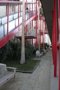
The whole vertical shaft thing becomes a theme around the Museum’s latest building, the newish Broad Contemporary Art Museum, which has red exterior accents, including plenty of red columns.

The landscaping in this part of the museum is interesting in that it uses palms or flat plantings. Virtually no shrubs. It’s a pretty urban planting that in part seems designed to give the homeless no place to camp.

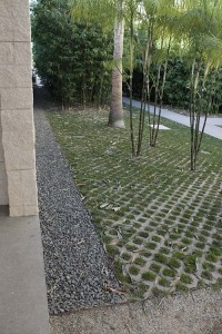
Most horizontal surfaces, using decomposed granite or this Turfstone product, are designed as walkable extensions of the concrete paving. Where does the landscape end and the urban fabric begin?

Here’s an interesting gardening aside: The Museums are located on the same big city block as the famed La Brea Tar Pits, where the ground oozes black, gummy tar, a substance that has preserved bones of sabertooth tigers and woolly mammoths from the last ice age that got too close to the stuff. Just imagine trying to garden where digging a hole to plant a shrub might put you in contact with the deadly sludge! I have yet to pick up a garden book that even begins to discuss what to do with this kind of soil problem. While the park containing the tar pits has a few gooey shoe-grabbing spots, these plantings seemed free of the muck.

My main reason for visiting LACMA was to take in a photo exhibit that reassembles many of the works that were seen in the seminal 1975 “New Topographics” exhibition of landscape photography. These works in the show signaled a break from the more romantic takes on what landscape photos ought to look like and engaged a land where the human presence reigned supreme.

One of my favorite photographers in the show, Robert Adams, often combines the romantic sublime with a cooler take on what the world really looks like. To the left is “Mobile Homes, Jefferson County, Colorado” from 1973 [ source ], a great example of what his eye sees. You get the sense in his work that the human landscape often fails to live up to the stunning geography where it’s sited.

Seeing his work again prompted me to reread some of his Beauty in Photography: Essays in Defense of Traditional Values. (From this photo you can see that he takes “traditional values” pretty broadly.) Here’s a quick snippet gardeners and landscape designers might like to think about.

Not surprisingly, many photographers have loved gardens, those places that Leonard Woolf once described as “the last refuge of disillusion.” Gardens are in fact strikingly like landscape pictures, sanctuaries not from but of truth.

–from the essay, “Truth and Landscape” in Beauty in Photography

In parting, let me move from beauty in photography to beauty in art. Here’s a closeup of Urban Light, backlit by the afternoon sun:


(For another example of Burden’s work, check out the installation of 50,000 nickel coins and 50,000 matchsticks that the San Diego Museum of Contemporary Art exhibited: The Reason for the Neutron Bomb.)

landscaping without plants

salk-looking-west

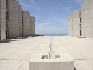
From my desk at work it’s less than a fifteen minute stroll to this viewpoint, which has got to be one of the most famous places to stand in all of modern architecture.

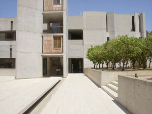
The view is of the central plaza of the Salk Institute of Biological Studies, which architect Louis Kahn designed for his client, polio vaccine pioneer Jonas Salk. The plaza features this simple water feature that pulls your eye towards the water, 400 feet below, and to the horizon and the sky. The materials of the plaza are reduced down to water, travertine marble and the angled concrete walls of the research buildings.

No plants. When Kahn was working on the design he’d had a conversation with Mexican architect Luis Barragán. Kenneth Frampton recounts Barragán’s seminal response in Studies in Tectonic Culture: The Poetics of Construction in Nineteenth and Twentieth Century Architecture:

“I would not put a tree or blade of grass in this space. This should be a plaza of stone, not a garden.” I [Kahn] looked at Dr. Salk and he at me and we both felt this was deeply right. Feeling our approval, he added joyously, “If you make this a plaza, you will gain a facade–a facade to the sky.”

As much as I love plants, I have to agree that this was the right decision. There’s an unphotographably joyous experience of pure space that settles into your mind as you stand or sit to contemplate the view.

salk-looking-north

If you can pull your eyes off the horizon–not an easy thing to do–you start to notice, however, that plants do figure in the plaza’s final realization. Immediately to the east are some steps, and planting beds on either side of the steps. As with a lot of modern planting design, the planters feature one kind of plant and one kind only. Considering the planting design was executed many years ago, probably in the late 1960s or early 1970s, long before the current focus on edible landscaping, it’s surprising that the plant of choice was orange trees, at least four dozen of them. (Maybe it has something to do with the environmental ethic that was developing while the Salk was being designed, an ethic that we’re finally rediscovering today.)

Below is a 360-degree panorama from the top of the steps. Just imagine walking west towards the horizon, at dusk, on a calm evening, as the orange trees begin to flower and scent the air.

salk-panorama-horizontal

hanging garden

These are the last of my Chicago tourist architecture photos, all taken on the campus of the Illinois Institute of Technology.

excelon-tube_1

One of the two buildings we looked at in detail is the recently completed Tribune Student Center, which is located directly underneath the elevated rail that cuts through campus. Most architects would have considered the site a disaster and likely would have shied away from the project. Rem Koolhaas, architect of the Seattle Public Library and some other recent high-profile projects, took the location as a challenge and swooped in with a solution so amazing it makes your head spin.

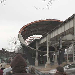
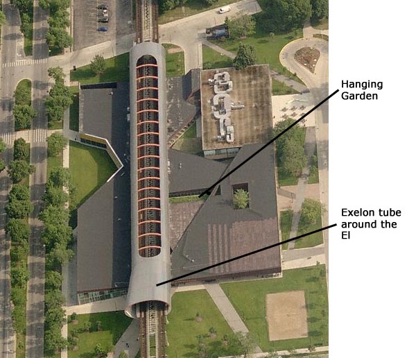
Noise and vibration would be the worst part of living below the tracks. But what would happen if you made a big burrito of the train by wrapping the rail overhead in steel and concrete? And what if you put holes in the top of the tube to direct the noise up to the sky? Here’s a shot of the exterior showing the tube and one side of the student center.

chicago-iit-koolhaas-interior

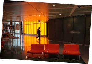
Inside, the center is a busy concentration of colliding lines and angles. And when a train passes overhead, you can still notice it. Only, it sounds more like a home heater turning on instead of a jet taking off.

One little piece of repose inside is what Koolhaas has dubbed the hanging garden. Part bridge, part green roof, this long rectangle planted with grasses brings light inside and introduces some nature into the dark world of industrial surfaces.

Green roofs are by definition on the roof, so you don’t usually get to engage them as directly as you do here. Dropping the roof down like this was almost as brilliant as wrapping the overhead railway in a tube. Unfortunately, this is the only part of the structure that uses anything resembling a green roof.

chicago-iit-koolhaas-hanging-garden-2

chicago-iit-koolhaas-hanging-garden

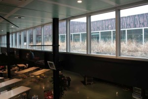
Here you see the hanging garden hovering over the tables of the cafeteria. It’s a little hard making it out in the picture, but it’s also a little hard teasing apart all the angles when you’re there in real life. This isn’t an architecture that’s all about clarity and purity and minimalism.

mies-portrait_1

mies-portrait_2

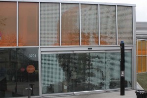
Although it isn’t remotely botanical, I enjoyed this other little detail. An entrance into the student center goes through this big portrait of Ludwig Mies van der Rohe, modern master of clarity and purity and minimalism. To enter on this side, you approach the portrait, the automatic sensor notices your presence, Mies’s mouth opens to let you in, and then proceeds to shut tight behind you to swallow you whole. Yum yum. (I’m not sure Koolhaas thinks highly of Mies’s work…)

Here’s an overhead shot of the whole center, based on the aerial photo at Live Search Maps:

koolhaas

chicago-iit-birches-2

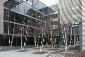
Returning to things definitely botanical, here’s a little planting of birches next door to the Koolhaas building, at Helmut Jahn’s student housing structure. Whether it’s a modern planting like this or a cluster in a residential front yard, there seems to be something about birches that makes people want to plant several of them together. Why is that?

Would a single birch look totally wrong? Would it be asking a single tree to stand in for an entire forest? Is this one of our unquestioned social conventions, or would a single birch simply be too transparent to hold its own? I’ll have to pay more attention next time I run across more birches…

Renzo Piano's Rue de Meaux housing project

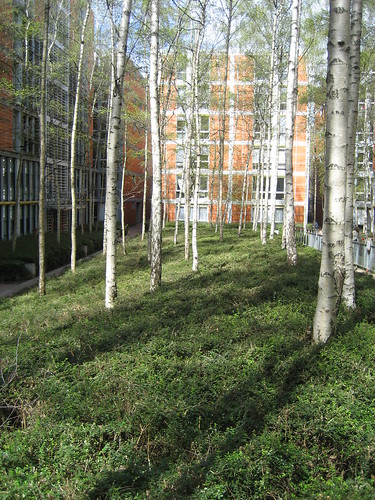
While you’re pondering this question, check out the landscaping done at Renzo Piano’s Rue de Meaux public housing project in Paris which uses many oodles of birches in its courtyards. This design doesn’t cluster the trees by twos and threes, but it sure does use a small forest of them. [ Image by lauraknosp via Flikr ]


plants in high places

A few weeks ago, walking on the UCSD campus, I noticed an interesting bit of agriculture taking place:

High-rise corn
High-rise corn

Why let a lack of soil and a third-floor location deter you from having a nice crop of sweet corn?


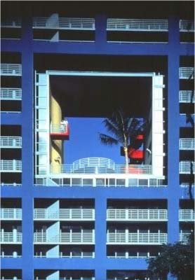
My brain, short-circuited and junk-stuffed as it is, quickly made the association to an illustration in an architecture magazine I’d looked at in the 1980s. The project was the Atlantis, a condominium tower by the Miami-based firm Architectonica. Aside from vibrating with Memphis-inspired early-80s colors, the condominium complex featured this amazing architectural gesture, a swimming pool and a single, large palm tree planted in a cube cut out of the center of the building, a hundred feet up.

Aerial palm at the atlantis, Miami
Architectonica. The Atlantis, 1982. [ source ]


Pretty wild, I thought at the time. And the photo still looks cool today. How would it hold up to a petite category-1 hurricane visiting town? I wonder. But hey, this is art. Who cares if the fabulous car with triangular wheels can drive you to the mall?