
We’re just about done with the exterior painting of the studio. Earlier I’d asked people for their opinions for plant-friendly colors to use. Town Mouse and Country Mouse each weighed in for lighter, warmer colors, partly in reaction to my saying I was leaning towards a dark urban gray. 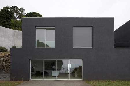 Barbara sent this link to a house (here, this first photo–this is not my studio) that had been painted a dark gray that had me kinduv excited. And Greg offered his idea for a bold color choice: lavender!
I was all set to go with the gray in the end, and then decided that it might be wise to try some big swatches against the garden. So I painted a panel with a sample patch of a color called “pencil point.” And while I was in the paint aisle I grabbed a couple of lighter colors to try for contrast, a pale faded green called “wasabi powder” and a light putty-gray-green called “organic field.” (How’s “organic field” for a color name that exploits today’s eco-consciousness?)

Here’s the final color test of panels laid up against the studio behind a blooming camellia and some emerging narcissus. I was hoping the plants would pop against the dark gray color, but was disappointed that they seemed to recede into the gray darkness. The lighter colors seemed to show off the plants better. Even the lightest gray-green didn’t seem to be too harsh in the way plants showed up against it.
I ended up liking them all, and after some conversations that went on for several days, John and I decided to use them all. Why choose?

This is the west side, the only side that will have plants against it, a combination of wasabi powder below and organic field above.

This is the south side, pencil point below, organic field above.

East side, pencil point and organic field. The greens don’t clash so badly in real life as they appear to in this photo taken in the tawny light right after sunrise.

…and finally the north, all organic field. (The door has just been painted gray, not shown here.)
Okay, it’s all almost a bit much. As Tim Gunn has said on Project Runway, “It’s a whole lotta look.” We’ll live with a while and use one of these colors for the fascia trim instead of the dark olive we used to tie it together with the main house in front. But there’s still a patio cover to rebuild, which will bring in another opportunity to tie things together.

Every time I get overwhelmed with what’s left to do I can pull out one of the early “before” pictures–this one of the south side. I’d call it progress.

And now back to things more botanical for a piece of trivia. The first photo has a shot of a young blooming Camellia sasanqua ‘Cleopatra.’ A little detail on this species of camellia versus the other commonly grown species, C. japonica, has stuck in my brain ever since I read it in Jake Hobson’s Niwaki: Pruning, Training and Shaping Trees the Japanese Way:
The most noticeable difference between the two lies in their flowers: C. sasanqua flowers drop petal by petal, while C. Japonica flowers drop off whole, which–as every Japanese person will tell you–made them unpopular among the samurai class, who were put off by the similarity they saw between the flowers and their own heads.

What fun! I like what you did with the colors.
As for the samurai, did they prefer being hacked to death bit by bit?
You were smart to give those colors screen tests. I can see why the “urban greys” appealed, but maybe they’re urban for a reason, plants don’t seem to like them. I liked your solution of painting the walls different colors! There’s some harmony among them, it seems to me, and I like it that you’re giving each of the directions a color.
Thanks for the C. sasanqua v. C. japonica clarification; I’d just been noticing the C. sasanquas in my quest to know more about camellias.
(Hm Town Mouse, that is a thought-provoking question. Maybe they felt it was more genteel.)
I love what you are doing. I get excited just seeing your pictures. Keep up the great work and enjoy!
Light gray with a hint of olive is our favorite color to show off plants, pretty close to your wasabi. Wasabi might have been a finalist for a wall we painted last January, I think.
Actually, I like all of these color choices, so I’m glad you were able to play them so well in concert together! And when you get the lavendar door as an accent piece, it’ll tie everything together! ; )
Love that tidbit about the rose heads. I was thinking I preferred the petal-by-petal conclusion, because I always like the way petals puddle on the ground below (cherry trees do it especially delightfully, I find)but hadn’t considered the samurai point of view!
Greg, Greg, Greg, still pushing the lavender, eh? (I suppose it’s better than pushing up daisies…)
I like the story about the petals. Beyond being interesting I think it talks about a culture really in touch with their plants and their world.