Category Archives: landscape design

colleen goes national

Magazine coverColleen Miko, owner of the Pacific Northwest’s Colleen’s, a Landscape Design Company, has one of her garden designs featured in the current issue of Organic Gardening Magazine. In the interest of full disclosure I’m glad to say that Colleen also happens to be my cousin through a couple of fortunate marriage links in the family. She’s received well-deserved regional notice for her landscape work, but this is her first national print exposure. (Edit, May 19: Anyone with access to cable might have seen her on TV earlier, when she was the finalist in HGTV’s Landscaper’s Challenge program.)

Rah Colleen!

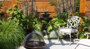
Here’s a peek at one of the spaces in her design. I like how the gently symmetrical plantings helps focus attention on the water feature. In other gardens, fountains and other focal points sometimes feel too small for the spaces they’re allotted. But Colleen’s strategy here gives greater visual weight to the burbling water and the area around it. The whiff of symmetry also brings visual calm that complements the calming sound of water. I’d love to spend some time in this space on a warm afternoon with a glass of Northwest riesling.

Pick up the June/July issue and see more of her work!

Green roof birdhouse

And be sure to pop over to Colleen’s website, where you’ll find other examples of her designs, as well as instructions on how to build this fun birdhouse with a green roof.

well endowed landscaping

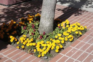
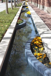
Here’s a little weekend quiz: Any guesses as to where I took this picture?

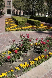
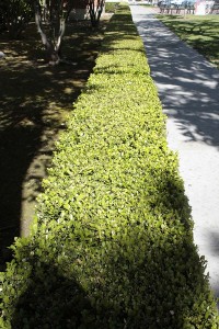
Does this second photo help?

Clue #1: It’s in Los Angeles.

Clue #2: It’s a university campus.

Clue #3: The school colors are echoed in the flower colors of the landscaping.

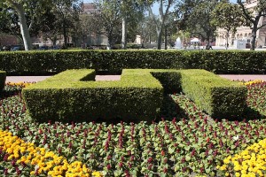
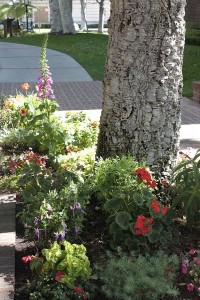
If you’re not into universities and their colors the answer is USC, the University of Southern California, where the planting color scheme features the campus colors of cardinal and gold. If you were to ask me for my opinion I’d offer that they’re probably fine colors for football uniforms but a little strident for most garden situations if they were the only colors you used. But the entire campus was vibrating with new plantings of red salvias and yellow-orange marigolds, with a few leftover winter plantings of pansies in similar colors.

I mentioned the plantings to one of the campus regulars I was up there to meet with. Apparently USC has an endowment (by what was probably an enthusiastic alumnus) to supply bedding plants in the school colors.

From the themed seasonal color, to the lawns, to the hedges, to the fanatically clipped creeping fig around the Romanesque windows, to the trees planted in regimented rows, it’s so not my philosophy of gardening.


Trees (and campus buildings) providing cooling shade
A flowering canopy, dozens of feet overhead

But for an urban campus set where the warm season is just that, the tall trees provide welcome shade and the many benches set in the plantings make for opportunities to sit and hold conversations. And the style of the landscape seems to come straight out of a tradition of how a campus should look: neat, orderly, with a sense that many things of worth come from Europe.

My parents met on this campus way back when. Looking at the comfortable but formal plantings, I think I that can understand them a little better, the attitudes where they came from. Lifting my gaze to take in the tall sycamores, the mature magnolias, I know that many of these trees were here when my parents attended the campus.

But as far as the team-themed bedding plants–Were they here then? I’m not so sure. I’ll have to ask my father about them, though it’s not the sort of detail he’s likely to remember.

A few plantings flaunted colors other than the official school ones. The trees and lawns featured green, of course, and here and there you’d find a non-conforming cluster of plants. I end with a couple final shots of those.

Another renegade planting that didn't get the cardinal and gold memo...

Acanthus mollis, not a sign of cardinal or gold

a visit to the l.a. county museum

Another quick stop over the holidays took the form of a visit to the Los Angeles County Museum of Art.

Installed at the new main entrance is this battalion of 202 antique streetlights, Urban Light, by artist Chris Burden. Streetlights like these of course were positioned at curbs in straight lines, spaced regularly. Clustering them together like this accentuates that fact, and to me makes the whole installation seem maybe just a little bit militaristic.

Arranged behind the Burden piece are some palm trees, the first plantings of what will be a large installation of palms by Robert Irwin. Irwin is the design force behind the Central Garden at the J. Paul Getty Museum, but here the trees will read less like a separate garden than plantings integrated into the art and architecture.

Their trunks echo the posts of the streetlights, as does the fact that they’re planted in a regular pattern. Also, as with the streetlights, they’re a collection of different kinds. A press release states: “Along with the palms, Irwin’s other medium is Southern California’s light, and the species of palms have been specially chosen to gather and reflect the interplay of light and shadow native to L.A.” [ source ] I love Robert Irwin’s work [ here’s a sample ], and I’ll be checking back on this installation as time goes on.
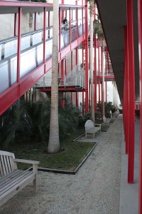
The whole vertical shaft thing becomes a theme around the Museum’s latest building, the newish Broad Contemporary Art Museum, which has red exterior accents, including plenty of red columns.

The landscaping in this part of the museum is interesting in that it uses palms or flat plantings. Virtually no shrubs. It’s a pretty urban planting that in part seems designed to give the homeless no place to camp.
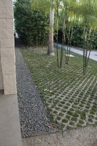
Most horizontal surfaces, using decomposed granite or this Turfstone product, are designed as walkable extensions of the concrete paving. Where does the landscape end and the urban fabric begin?

Here’s an interesting gardening aside: The Museums are located on the same big city block as the famed La Brea Tar Pits, where the ground oozes black, gummy tar, a substance that has preserved bones of sabertooth tigers and woolly mammoths from the last ice age that got too close to the stuff. Just imagine trying to garden where digging a hole to plant a shrub might put you in contact with the deadly sludge! I have yet to pick up a garden book that even begins to discuss what to do with this kind of soil problem. While the park containing the tar pits has a few gooey shoe-grabbing spots, these plantings seemed free of the muck.

My main reason for visiting LACMA was to take in a photo exhibit that reassembles many of the works that were seen in the seminal 1975 “New Topographics” exhibition of landscape photography. These works in the show signaled a break from the more romantic takes on what landscape photos ought to look like and engaged a land where the human presence reigned supreme.

One of my favorite photographers in the show, Robert Adams, often combines the romantic sublime with a cooler take on what the world really looks like. To the left is “Mobile Homes, Jefferson County, Colorado” from 1973 [ source ], a great example of what his eye sees. You get the sense in his work that the human landscape often fails to live up to the stunning geography where it’s sited.

Seeing his work again prompted me to reread some of his Beauty in Photography: Essays in Defense of Traditional Values. (From this photo you can see that he takes “traditional values” pretty broadly.) Here’s a quick snippet gardeners and landscape designers might like to think about.

Not surprisingly, many photographers have loved gardens, those places that Leonard Woolf once described as “the last refuge of disillusion.” Gardens are in fact strikingly like landscape pictures, sanctuaries not from but of truth.

–from the essay, “Truth and Landscape” in Beauty in Photography

In parting, let me move from beauty in photography to beauty in art. Here’s a closeup of Urban Light, backlit by the afternoon sun:
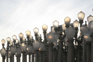

(For another example of Burden’s work, check out the installation of 50,000 nickel coins and 50,000 matchsticks that the San Diego Museum of Contemporary Art exhibited: The Reason for the Neutron Bomb.)

“plants are up to something”

I loved this banner at the Huntington. Hanging outside the instution’s conservatory building, it announces that the exhibits inside might be more oriented towards education than the gardens that make up the rest of the grounds. The conservatory also houses plants that might have special needs beyond the “just add water” plantings located in the subtropics outdoors.

Pass through the front doors and you step into a greenhouse space containing a miniature tropical rainforest, a cloud forest and a bog garden, along with lots of educational signs and interactive exhibits scattered throughout the space.

For me most greenhouses and conservatory gardens suffer from being examples of nature-in-a-can, and to me they tend to look and smell and feel very similar in their hermetically sealed spaces. If only the Huntington were located on some barren snowy tundra plain, where entering a tropical rainforest on a cold winter day might be a stunning revelation.

Even on this cool December Southern California afternoon, the temperature differences between inside and out weren’t that pronounced. And the lush plantings outside the front door seemed to mirror the lushly planted indoors. Still, lacking the stunning contrasts that might help to set the conservatory apart from the outdoors, it was a fun place to connect with a lot of cool plants. When the Huntington’s giant corpse-flower (Amorphophallus titanum) blooms, there is where you’ll find it. It wasn’t blooming, but there were lots of other interesting things inside.

The bright red-orange trunks of the sealing-wax palm, Cyrtosstachys renda were pretty amazing.

My visit was two days before Christmas, so there were this holiday display of poinsettias and amaryllis. At first they seemed like gratuitous holiday decorations but then the aha moment struck me that these plants originate in the tropical and subtropical belt of the Americas.

Floral parts of a large anthurium species…

This carnivorous Asian pitcher plant (a species of Nepenthes) greeted visitors as they entered the cloud forest display.

And dropping down into the bog garden, American pitcher plants, Sarracenia, and sundews, Drosera sp., let viewers see other ways plants have taken up carnivorous ways. (Do you detect a theme of the conservatory playing up the idea of scary, creepy plants, going from these carnivorous species to the stinking giant corpse flower that lines up visitors by the hundreds when it does its thing?)

At this point the blogger rambles on a bit: These days it almost seems that every botanical collection feels to have its very own giant corpse flower plant that will draw the visitors when it blooms, something of the way medieval churches tried to draw pilgrims by having unique relics of saints, or how many temples in Asia will claim to have preserved hairs of the Buddha. So it seems that the giant corpse flowers has become a modern secular botanical relic. It’s a little odd, since you can occasionally find the plant for sale on eBay–granted for a good chunk of change–but still nothing much more than you’d pay for a pair of high-end jeans.

Okay, now back to the trip…

I’m coming to the realization that greenhouses always scare me a bit, like I’m entering a world that’s on perpetual life support. Upon leaving the conservatory I stepped outside into the bright December afternoon. Not far away a reader was seated in warming sunlight on a Lutyens bench, enjoying the moment. I’d had a good time on my visit to the synthetic tropics, but returning to the real sunshine and real weather outdoors I suddenly felt free.

the huntington desert garden

The late-December light was fading when I headed to the wild and wonderful plants that make up the Huntington’s Desert Garden. The garden dates back many decades and features some immense specimens the likes of which you’ll almost never see. But what I love most about the garden is that it incorporates these great plants into landscapes that both honor the plants and use them in striking combinations.

Many aloes were blooming with their dramatic spikes of hot, bright colors. The theatrical lighting helped to make some of the scenes even more dramatic.

(Be sure to click onthe third image to enlarge it. In its unearthly weirdness, it’s got to be one of my favorite garden photos I’ve ever taken.)


One zone of the garden focuses on plants you’d find in California. Here a creosote bush serves as a screen for a radiant gray-white agave.

And this scene employs the coastal and Channel Island buckwheat, Saint Catherine’s lace (Eriogonum giganteum)–a plant that technically doesn’t come from a desert–with other dryland plants. The gray-green foliage on all of them helps to unify this diverse planting.

The Huntington is in a warm subtropical area just east of Los Angeles. That doesn’t mean that it’s warm enough for all of these plants. Patio heaters of the kind that you see outdoors at restaurants keep plants warm at night in one area of the garden. (These are the frigid depths of December, after all.)

Now, as much as I was trying to focus on the overall landscape, I have to share a few photos of individual species that caught my eye.

Looking up at a very large Yucca filifera from Mexico…

(There’s an extremely similar shot of the exact same plant on the Germanatrix’s post on her visit to this same garden at the end of November. Check it out: here.)

Two tall palms with immense tree aloes, Aloe barberae. At the Huntington the species is identified as A. bainesii, but the taxonomists have had a change of heart. I have two of these in my little front yard, the tallest of them still under twenty feet but still impressive at that size. The writeup on this plant says it can hit fifty feet or more. The Huntington specimens are just about there, I’d guess.

A dynamic and lyrical tangle of leaves on several plants of the variegated form of Agave americana… (Homage to somebody… later Willem de Kooning? Franz Kline?) Agaves with their perfect rosettes seem to appeal to the part of our brains that appreciate symmetry and order. This planting subverted the expected into a beautiful mess.

A tall, dense stand of Cleistocactus straussii

As we left the Huntington the light that had made the Desert Garden extra-interesting was coloring up the flanks of Mount Wilson and the the rest of the San Gabriels.

Not far away from the Huntington is Pasadena, the site of the annual New Year’s Rose Parade, which should be getting under way not long after this post hits the web. (Okay, it’s sort of a lame way to try to segue this post to the topic of New Year’s Day, but–hey!–I had to give it a try.)

Happy New Year’s to all of you, and best wishes for a healthy and prosperous year filled with amazing botanical highlights.

the huntington’s japanese garden

After visiting the dense and somewhat frenetic new Chinese Garden at the Huntington I was feeling like I needed to unwind a bit. Fortunately a short walk at the Huntington delivers you from the Chinese Garden to the Japanese Garden.

Along the way, before you get to the garden itself, as if in a calculated attempt to transition the viewer from one garden to the next, you pass a couple blooming plants that have “Japan” in their species name. Although most of the camellias in bloom were the sansanquas, a few of the Camellia japonica plants were starting their bloom.

And there was this perky yellow species, Farlugium japonicum–with a plant label (Thank you!–I love my plant labels).

One of the first details that I noticed in the Japanese Garden was this walkway edge detail consisting of little loops of thin bamboo.

Whereas many of the hardscape elements in the Chinese Garden seemed to be built to last for the centuries–this photo shows one of the edging details there–the fragile little detail in the Japanese Garden appeared to be set up to celebrate the ephemeral.

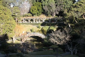
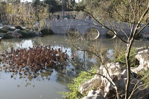
All the approaches to the garden deliver the visitor to high vantage points overlooking plantings around a small pond. A moon bridge provides a focal point.

A recreated traditional upper-class Japanese home occupies the highest spot in the garden.

Its doors slide open so that the view from the house is of this garden. Standing outside, you can peer in and get a sense of how life indoors would look like and feel. This structure was moved to this site in 1912, so it and the gardens have been around many more years than the Chinese Garden next door.

Steps from the home lead down and then back up to a walled garden.

A broad walkway divides the garden into two parts. To one side is a symbolic garden of stones and raked gravel, or Karesansui.

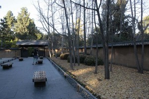
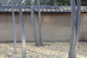
To the other side is a simple planting of clipped azaleas, ginkgo trees and what I’m guessing is lawn. The lawn and the tops of the azaleas mounds, however, were covered with fallen leaves off the ginkgo trees. I loved this space in its simplicity and could have spent hours there.

A very few of the ginkgo trees still held on to their startling yellow leaves.

But most of the leaves on the ground were progressing from bright yellow to tan to brown.

Here’s a suggestion for the Huntington: How about setting up a ginkko hotline or RSS or Twitter feed? Desert parks commonly offer wildflower hotlines to alert you of peak flowering. Something similar to let you know when the falling leaves would be at their most spectacular would be great too. Still, it was a gorgeous effect, and it highlighted the natural process of bright yellow leaves aging into less colorful ones.


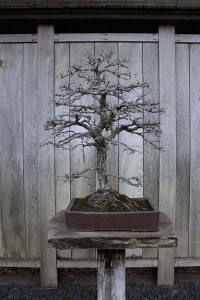
After the walled garden is a bonsai court containing some spectacular specimens in a simple, rustic setting. The Huntington is in the process of enlarging the display area to make room for more bonsai.

My last shots from the Japanese Garden are of two gorgeous stands of bamboo. A small grove adjacent to the “model home” has a small wooden pathway through it.

A more massive stand occupies a spot at the edge of the garden.

Inside the dark thicket Camellia sasanqua blooms.

What is it about a grove of bamboo that drives visitors to carve their initials into the culms? Grrrrrrr.

A final look at the rhythms and contrapuntal interplay in the bamboo…

framing the garden view

Here are just a few more photos left over from my post yesterday on the Huntington’s recently-opened Chinese Garden.

I mentioned how there were many layers to the spaces there. The following are some of the doors and windows in the garden that help to frame the views and contribute to the sense of layering.

Leaf-shaped window near the Studio of Pure Scents.

Stacked portals of the Terrace of the Jade Mirror.

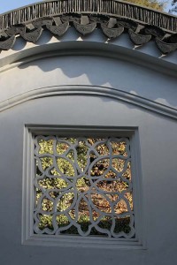
These last two windows in the outside wall, the Wall of the Colorful Clouds, are interesting in that they’re not perfect squares. The top, left and right sides form part of a square, but their bottom sides parallel the contours of rolling ground where the wall is sited. Even though you’re looking at an element in the human-created hardscape, this technique acknowledges the earth where the wall stands.

Yet to come: posts on the Huntington’s Japanese Garden, Conservatory and Desert Garden.

new huntington chinese garden

On the way up to Los Angeles we had a chance to make a quick stop at the Huntington Library, Art Collection and Botanical Gardens in San Marino. Their Chinese garden, Liu Fang Yuan, the Garden of Flowing Fragrance, opened to the public just last year. Fund-raising is ongoing for a second phase of construction, and the plants that are there are still on the young side. Still, it’s not too early to take a look at what’s being billed as the largest garden of its kind outside of China.

Two stone lions guard one of the alternate entrances into the garden.

Hand-carved stonework and elaborate hardscape details figure prominently in the garden’s design. It’s worth taking your time to appreciate the details close up.

This walkway resolves to the adjacent planting in swooping tiled edges.

Patterns made from pebbles fixed in cement take several forms. Here’s one design.

…And a detail of another designs…

…And an overview of yet another of the patterns using pebbles.

These hardscape details are dense and busy. Plantings are also fairly dense, with many kinds of plants used in a small space. Move a few feet in any direction and your view of the garden changes radically.

The overall effect is kaleidoscopic, and the garden encourages active engagement with the space.
Continue reading new huntington chinese garden

one wall to go

The house projects continue. We’ve worked around my little studio building and are now on the final stretch, 22 feet of wall that backs a raised planter. There’s only one window to worry about on this wall, but all the plants are making it a delicate demolition operation.

Mashed Heucherias

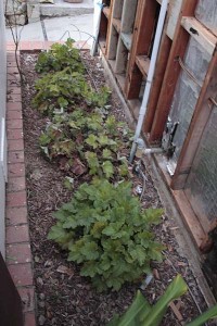
Some of the greenery is looking a little trodden on. This is a row of island coral bells, Heuchera maxima, that hasn’t escaped the occasional stomping on by a random foot. But for the most part these should look okay in a couple months after the rains perk them up.

Pruned green rose

I pruned this plant out of the way. It’s my only rose, the green rose that I’ve been growing since my early teens. September and October aren’t prime rose pruning seasons, but I’m hoping the plant doesn’t mind too much.

Bonbero pepper

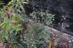
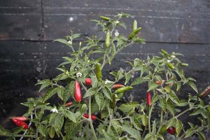
This plant, a Bonbero hot pepper, so far has escaped being stepped on or having pieces of old siding dropped on it. It’s nearing the end of its short period of productivity, so I won’t stay up nights worrying about it. Still, now that the hot peppers are coloring up red against the leaves, I’d miss having it in the garden.

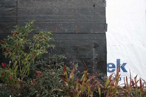
We’re still undecided about what color to paint the siding once we get it up. I was thinking dark and dramatic, and only somewhat kidding suggested to John that we “paint it black.” When we got down to the final layer of old tarpaper it was a chance to preview what a dark color would look like behind the plants.

Black and white walls

Here’s the black of the tarpaper with the new white Tyvek house wrap for contrast. The white looks awfully harsh against the plants in the foreground. White is a good to accentuate some sinewy branches or the architectural contours of a dramatic plant. But the contrast between the white and the plants is really extreme, and we probably won’t be going with light colors. The dark colors recede nicely behind the plants, a feature that might be nice in this narrow garden space. The leaf colors contrast against it gently, but I worry that the plants might get a little lost.

One of the really popular tinted stucco colors being used in the neighborhood right now is a dull dark green color, which to me seems like the worst color possible for setting off green plants. Silver-leaved meditteranean and native plants can stand a chance of contrasting against it, but it’s pretty deadly for leaf-green plants. So we definitely won’t be doing dark green.

But a dark urban gray? I even thought of a dark red, but the house came with what seems like ten acres of brickwork, so I think that’d be too much as well.

We still have a week or two before we commit to a color. What would be hip, soothing and flattering for plants all at the same time? I’m one of those people who could spend hours looking at paint swatches, but that’s easier to do than the hard construction work that I need to get out of the way before getting to paint colors.

That said, I’m still a big believer in the power of color, and it could be more important decision in the long run than where we decide to move a wall outlet. Decisions, decisions…

no drought in these gardens

After living with drought for the last several years it’s refreshing to take a look at some gardens where water appears as an unlimited resource. Last weekend’s L.A. Times Home section featured an article on iwagumi, the art of aquascaping. Take a Japanese garden aesthetic, only apply it to a fishtank, and you have a basic take on iwagumi.


Above: Luis Carlos Galarraga, Sao Paulo Brazil, “When the rocks flow.” [ source ]

Each year the Aquatic Gardeners Association hosts a competition for photographs of these carefully planted tanks. (This year’s contest deadline is September 30.) Contestants have to apply the same design sense that they’d need to work with in a garden on land. But instead of the familiar plants of the terrestrial realm, they’re using aquatic species, most frequently planting them among an assortment of striking stones. In these gardens the delicate creatures overhead aren’t birds, but fish.

The image above and the two below are medium-sized tanks from last year’s competition. Click on the “source” link and you’ll be taken to the page where you’ll see more images of each project, along with comments from the competition’s judges. It’s a very specialized aesthetic that they’re employing in the scoring, but the comments are interesting to read with a grain of salt, and might give you ideas on how to play with plants and space in gardens that live on the other side of the water table.


Above: Mélisse Moireau, Sarcelles France, “Grassland sunset.” [ source ]


Above: Michal Pasternak, Krakow Poland, “Sunset.” [ source ]

Since we’re air-breathing creatures these tanks transport us to a realm where we normally don’t have an opportunity to look at in any detail. They remind me a lot of the photography of Karen Glaser, a Chicago photographer that I had a chance to exhibit with a few years back in a group show here in town at the Museum of Photographic Arts. Much of Karen’s work is taken underwater, in the oceans or in swamps. Her magical, mysterious work is nothing like the clichés that make up most other underwater photography.


This image:
Karen Glaser: Dust Storm in Catfish Sink, 2006, Pigment Print on Hahnemühle Photo Rag, 37x25in.

Check out her website for lots more examples of her beautiful work.