Category Archives: landscape design

more mediterranean than thou

Gosh, it’s been a while, hasn’t it? The main distractions keeping me away from posting have been a couple of classes I’ve been taking to fill in some art history holes I hadn’t bothered with before. For one of them I’ve been doing a little research on Granada’s Patio de la Acequia, the “Courtyard of the Aqueduct,” one of the gardens at the Generalife, the garden fortress across the canyon from its more famous neighbor, the Alhambra.

This particular garden, a long, rectangular space with a central water feature 162 feet long and 4 across, holds the distinction of being “…the oldest ornamental garden in the Western World, with the additional value of never having ceased to be a garden during the last seven centuries” (Casares-Porcel et al. in Delgado et al., 2007).

I enjoy creative research of this sort, and I thought I’d share some of the cool things that I’ve been finding out.

Today, the garden looks like this:
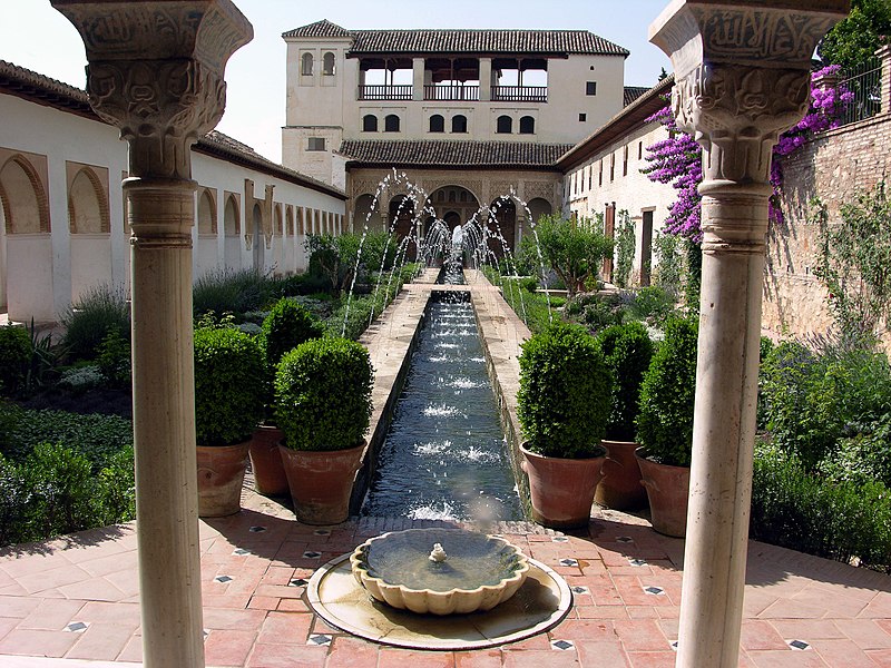
Patio de la AcequiaPeter Lorber. Gartenanlage Generalife, Alhambra, Granada, Spanien eigene Aufnahme, Erstellungsdatum 22.Juni 2006. Photo via Wikimedia.

But like any garden that’s been a while it’s undergone some major changes. The plants, for sure, have gone through a few generations and some major changes. For example, the big splashy bougainvillea that you see behind the column capital on the right side would in no way have been part of the original garden. The Patio was started in the later thirteen century. Bougainvilleas weren’t described until the 1700s, and didn’t make it to Europe until later. And the big splashy fountains are generally bogus to the original as well, having been added in the 1940s or early 1950s by architect Francisco Prieto Moreno. (EDIT: Sep 19: While the fountains are not original, their appearance pre-dates Prieto-Moreno’s work on the garden. I’m still researching when they appeared.)

But the one really mind-blowing discovery that came about in this garden was the result of some excavations done in the wake of a catastrophic fire that consume one of the adjacent structures. Archaeologist Bermudez and his team dug and dug and didn’t encounter the original soil line until they got 70 cm. beneath the level of the original pavement. And his and others’ research began to paint a picture of a garden with planting beds sunken deep between the walkways and water features.

Part of me–the gardener side–says “so what.” Maybe they just dug out the old icky soil and added a new layer on top. But excavations in Seville at the gardens of the Alcázar have found garden beds with stucco decorations on their sides. Others had fresco paintings. So that pretty much convinces me that they weren’t going to all that bother just to bury their ornamental garden bed decorations under a pile of garden soil, and it reveals that these were part of a garden tradition where they had lowered planting beds at least some of the time.

Below is a photo off Flickr of one of those gardens at the Alcázar, the Patio de las Doncellas, the Courtyard of the Maidens, that’s been restored to its original low soil surface. In gardens today you’re used to seeing raised beds, or garden paths near the level of the surrounding plantings. But this? Wow. (There were probably fewer personal injury attorneys around in medieval Spain, so I doubt the ropes at the edges of the garden bed reflect the original way these beds would have been experienced.)
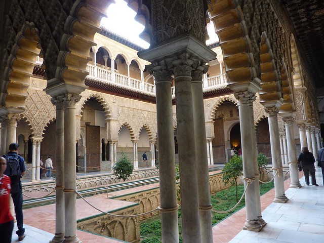
Patio de las Doncellas, SevilleChristophe Porteneuve. [Patio de las Doncellas, Alcázar, Seville]. Photo via Flickr.

And the last piece of information related to all this was a little graph that I put together trying to see how my local climate stacks up to Granada’s, rainfall-wise. On his most recent visit to lecture at my local California Native Plant Society, Bart O’Brien, author and Director of Special Projects for the Rancho Santa Ana Botanic Garden, pointed out how California’s mediterranean climate is the most extreme of all the five main mediterranean climates in its extremes of wet and dry.

The following compares Granada, located at over 2000 feet of elevation against sea-level San Diego, so this isn’t the fairest of comparisons. And Granada’s annual rain fall is something over 14 inches, versus San Diego’s average of slightly over 10 inches. But you can get a general sense of how extended the California summer dry can get.


Special rights on this post, to comply with the Creative Commons Attribution-NonCommercial-ShareAlike license of the first image:
Creative Commons License
More Mediterranean than thou by James SOE NYUN is licensed under a Creative Commons Attribution-NonCommercial-ShareAlike 3.0 Unported License.
Based on a work at www.soenyun.com.
Permissions beyond the scope of this license may be available at http://soenyun.com/mailform.html.

outdoor rooms versus the garden

I’m starting to worry about the Jamie Durie’s of the world. I, as a gardener, am getting concerned that the kind of landscaping he represents—outdoor spaces that are becoming increasingly indistinguishable from tightly decorated indoor spaces—seems to be taking over.

Take a look at what people are doing on home makeover shows, including Durie’s own The Outdoor Room on HGTV. Look at the increasing bulk of outdoor furniture in catalogs. Or just go shopping for a patio set, which is what we did recently.

Some of the smaller-scale outdoor furniture we saw...
...and more of the smaller-scale furniture...

The mismatched plastic sets we’ve from as long as fifteen years ago that been living with were looking long in the tooth. We wanted a simple table and chairs for the roof deck, and maybe something for the back patio. Yes, we found tables and chairs in the stores…

Some of the bigger-scaled seating, as uncomfortable as it is large.
Yet more. At least this set was comfortable.

…But there’s been a huge explosion in huge-scaled resort-themed seating, much of it wrapped in synthetic wicker. They tell you to “think big” when selecting furniture scaled to the larger outdoors, but so much of this would be all out of proportion to the average garden. In all this McMansion-scaled furniture I kept seeing Jamie Durie, and I wondered:

A. Who has space for all this huge furniture? and,

B. What happens to the space devoted to gardens when the inside starts to sprawl outdoors?

A 2010 interview in the LA Times didn’t raise my comfort level. When asked about the basic focus of his recently launched TV series Durie replied, “The reason I created this show was to cast a wider net and reach the non-gardener. I want to encourage people interested in travel, architecture, design, food or even fashion — and the show really encompasses all that. It’s really just laced with gardens, which is the icing on the cake.” How do you reconcile this statement with the tag line for his website, jamiedurie.com: “Connecting people with plants”?
These outdoor rooms are spaces where potted plants are largely interchangeable with throw pillows. Planted surfaces and garden beds give way to hardscape. The dominion of humans, sheltered indoor spaces, make their move to transform the outdoors into places where nature gets increasingly marginalized. Humans domination marches ahead.

Contrast these with garden rooms of the past, which seeme more about the plants, often featuring walls made out of plants and living green things underfoot. Our generation’s outdoor rooms seem to be all about the humans. For a purportedly green-conscious era all this seems backwards.

Is anyone else bothered by this? Or is it just me?

long, winding path

Sunday we went up to LA for a family birthday. While we were up there we stopped by Los Angeles Modern Auctions, which was having a preview for an upcoming sale that includes some really cool items by Ettore Sottsass, one of my favorite 20th Century designers. Paintings, sculpture, furniture, general stuff: you can see it for years in books and magazines but the experience of coming face to face with it can be pretty different.

Once of the not-by-Sottsass lots in the sale is this immense garden path designed by California ceramic artist Stan Bitters, a student of Peter Voulkos. Like Voulkos his work is inspired by the material of clay itself–And how can you get more earthy, more primal than clay? Ceramics, gardening, it all can come from the same place.

The path can be assembled in several configurations, and in this configuration coils more than forty feet long. The piece comes from the later 1960s, at a time when Bitters was working with a ceramics manufacturer that basically gave him 20 tons of clay to see what he could make out of it.

When someone gives you 20 tons of clay you make big things, and this is just one of many examples of the really really big artworks he started to create. Most of his works of that era grew out of collaborations with architects–Big work works really well outdoors.

His work is all over public spaces up in the Fresno area. In recent years he’s been doing public and private commissions in the Los Angeles and Palm Springs areas.

The garden path looked a tad cramped and out of place on display in a warehouse full of polished modern and postmodern furniture and art, but just imagine this snaking its way through a landscape. Very cool.

This was a path he made for his own home and garden, and it has a gentle casualness, a welcome lack of striving, that you can see in the private pieces artists make for themselves and friends. You can make out the casual, earthy surface details and glaze in this detail.

So if your garden needs a casual but still pretty stunning focal point here’s your chance. You’ll probably need to rent a very large truck to bring it home.

hiding from the neighbors

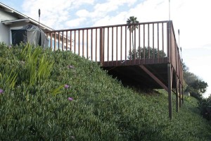
We have new neighbors immediately behind the house next door. One of their first acts was to erect this gonzo back deck.

The previous owner was a house-bound woman who for the last twenty years of her life lived mostly indoors. Her back fence stopped at the property line and was six feet high. We never saw her, she never saw us.

The new owners, a young couple, apparently didn’t care for the big dark fence getting in the way of their view. And they apparently didn’t think their back yard was large enough since the new deck juts out many feet into a city easement. I’m sure they have a great view of the ocean. But using the equation, I can see them = They can see us, I’m certain they also have a tremendous view of my back yard.

There are a few islands of privacy. This black bamboo provides a little bit of screening–if you’re standing in just the right spot.

But this view from the bedroom window shows that the isn’t much privacy from much of the garden. I planted a Dr. Hurd manzanita in front of the bamboo, before the new neighbors moved in. Once it hits its twelve foot target, it’ll help provide some shelter. But being a manzanita it’s taking its good old time getting larger. Had I known we’ve have this privacy issue I’d have planted something faster growing, maybe a desert willow.

A few things get in the way of planting more large plants on the property line. There’s a buried drain–not the best thing to plant a small tree over. This is also the the southern edge to the property. A tree would provide some shelter, but it would also shade a garden populated with sun-loving plants and homeowners. Also, the previous owners of our house installed a large fishpond in what would be the most welcome spot for a small tree.

We’re still trying to think of what to do. Until we have a larger plan in place, we’re letting some plants get taller than we otherwise might. This mystery shrub came with the house. Although it’s growing too close to a fence to let it get very large, we’re still letting it grow taller. There’s one of these plants in the canyon nearby and the best idea I have is that if it’s native it might be a Pacific wax myrtle (Morella (formerly Myrtica) californica), but I think the ID is incorrect because Calflora shows its native range ending to the north, in Los Angeles County.

Here’s a closer look at the foliage. Later in the year it has tiny white flowers with an insanely powerful fragrance–gardenias on steroids, maybe. Feel free to send me any ideas for this plant’s identity. It’s probably wishful thinking on my part thinking this is a native instead of an escapee from one of the local gardens.

[ EDIT, January 24 ] Well, I knew you guys would come through! Maggie and Bahia have pointed me in the right direction. Thinking that it was a local native was definitely wishful thinking on my part. The mystery shrub is a Victorian box, Pittosporum undulatum. The fact that it’s escaped into at least one spot in the local canyon makes me think that this is destined not a long-term plant, particularly when you consider that it can get massive size for a suburban lot, not to mention it’s ridiculously close placement to the fenceline.

The California Invasive Plant Council describes its problem potential this way: “Infestations in CA are small. More problematic on north coast.” Not the worst plant, but I could definitely do better.

The privacy problem could be worse. The neighbors spend almost no time outdoors, and much of that is in the relative privacy of darkened evenings.

Still, gardens are as much about fantasy as they are reality. It’s not that we’re doing anything particularly scandalous in the back yard, really. But if we were, we wouldn’t want the neighbors to see!

amusing landscape

Our weekend Netflix viewing was The Savages, a 2007 film starring Laura Linney and Philip Seymour Hoffman who play a sister and brother who are called in to care for their ailing father. The siblings leave New York City and Buffalo in the fall to pick up their father in Sun City, Arizona.

I laughed at some of the establishing shots of the landscaping in Sun City. I had to share.

Long rows of these soccer ball trees are shown all over Sun City.

Houses with these ball shaped trees...
Big palm trees, but the planting budget didn't allow everyone to get one of their own...
This hedge really got me laughing. What emerges from behind the hedges two seconds after this shot is even funnier...

As far as the film, I liked it. As expected, the siblings have issues between them, including some sibling rivalry that’s simmered for four decades. But all in all they’re adults trying hard to do the right thing for their father: nothing too Hollywood and cloyingly uplifting, but nothing that’s a real downer, either.

Of course such mature behavior would never fly in many families I’m familiar with. Overall it left me with the feeling that’s best summed up by a bumpersticker John has that hasn’t made it onto a vehicle yet: My Family is More Dysfunctional than Yours.

landscaping horror: where diy meets wtf

One of my friends recently turned me on to Regretsy, a blog that gathers together some of the more unfortunate objects that earnest DIYers have made and posted for sale at the Etsy craft site.

I really like Regretsy’s tag line, “where DIY meets WTF,” and I’ve borrowed it for the subtitle of this quick post on a new garden space that went up in my neighborhood, a bit of landscaping horribleness that seemed perfect for Halloween.

I thank John for noticing it first and pointing it out to me, knowing how well I’d appreciate it. “It’s on the right as you head down the hill. You can’t miss it.”

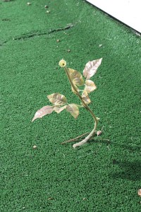
Ah, what a wonder: plastic grass-colored indoor-outdoor carpeting, one of my personal favs…placed naturalistically between the sidewalk and the side fence…

But it gets better! Ever six feet or so, next to the fence, the designer has planted big red silk roses. I’m sure they were meant to coordinate with the red curb.

A garden made out of dead things emulating live ones. Zombies. Plastic roses. Be afraid. Be very afraid.

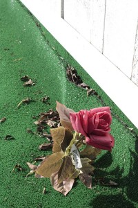
One of the dangers of having lovely flowers next to a public walkway is that someone might want to pick them.

One of the roses planted in this plastic lawn. Note the price tag still attached.

Could this be the latest avant-garde garden designed by Martha Schwartz, who’s incorporated plastic plants into her designs, as in her [ Splice Garden, at Cambridge’s Whitehead Institute ]?

No, sadly, probably not. But I will force myself to say something nice about it: At least it doesn’t require watering, except maybe to hose off the dust.

a palm garden takes shape

I’m sure I’m not the first to have noticed the irony: The main approach to Los Angeles County Museum of Art takes you through the BP Grand Entrance. The back way in takes you through the La Brea Tar Pits.

When I took the photos on the last day of July crude oil was still gushing into the Gulf of Mexico, and the irony was heavy like the odor of tar coming from the fenced-off pits where archaeologists were working behind the museum on extracting critters and plants that got caught in the ancestral goo.

Here, junior’s ball has somehow made it over the fence around one of the pits. You could maybe rescue it with a stick…or you could wade through the tar and hope that you don’t get caught, only to be discovered by archaeologists a few millennia down the road.

We arrived at the museum an hour before it opened, via the back entrance, so we had a chance to spend some time with Robert Irwin’s Palm Garden Installation. I posted [ before ] on the earlier stages of the garden, and it’s still not complete. But by now you can really make out many more of the elements of what the final garden will look like.

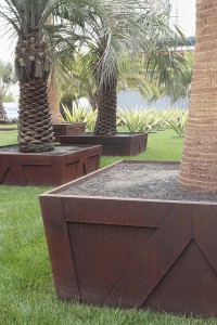
There are many palm species used in the garden. A number of them are planted in a lawn, inside planter boxes that mimic the wooden planter boxes the trees were grown in. But unlike the wooden temporary planters, these permanent homes are made out of thick steel plate–the “it” material of the moment for well-financed modern gardens.

A closer look at the planter box…

In a back corner you could see a collection of palms in pots, and in this photo you can get a better idea of the kind of planter box the steel ones are meant to suggest.

Another look at some of the palms in transition… In this installation some of the plants are rotated out according tot he season. I’m not sure whether these are headed in or out.

LACMA was about to open a new facility, the Resnick Pavillion designed by Renzo Piano. As the building nears completion more elements of the Palm Garden Installation are being planted. In addition to palms it includes several of the non-palm species. These are some spectacularly variegated agaves plants of a furcraea, possibly Furcraea foetida ‘Mediopicta’–Thanks for the correction, Loree!

The way the plants have been shaped, with the lowest leaves removed, made them look like variegated New Zealand flax (phormiums) until you got close to them. It’s not a bad look. It’ll be interesting to see if these agaves furcraeas are kept pruned this way or whether they’ll be allowed to grow into the rosettes that agave furcraea growers are used to seeing. This is in no way a naturalistic garden, so my guess is that the agaves plants will be kept this shape. Besides, how do you mow around them without running over the leaves?

Detail: Furcraea foetida, I think

Another detail of the variegated furcraeas

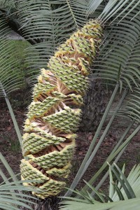
Another of the non-palm species: this cycad developing this really cool cone. It’s probably something like three to four feet long.

A bench and real palms outside the Resnick pavilion…

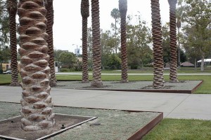
The single most dramatic gesture is the placement of this palm with a thickly bulbous trunk that’s been planted in a tight opening that leads two stories down into a parking garage. The effect is like staring down into a North Dakota Minuteman missile silo. It’s more than a tad unsettling, and asserts that garden-making can be about more than designing pleasant, unchallenging spaces.

Say “Los Angeles” to someone and ask them what comes to mind. Palm trees would probably be one of the first things the person might bring up, even though the city’s official tree is the coral tree is and the official flower the bird of paradise. “Cars” would probably be another. Here palms and cars come together, with a short arcade of the trees lining the driveway down into the parking garage.

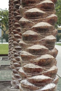
I’m not anything remotely resembling a palm expert, so I can’t tell you what species this is. But I can show you that it has amazingly sculptural trunks.

Looking up into the fronds gives you the sensation closest what you get from many of the artworks Robert Irwin did before he designed gardens. The fronds filter the light in interesting ways, and two or more layers make things darker than just a single layer. If you stand in the driveway and look straight up the negative space of the sky reads like a bright zigzag between the delicate layers of palm.

If you’d like to compare the effect of the palm fronds to an earlier Irwin piece, here’s a corner of his Running Violet V Forms, a piece that I walk around and under at least twice a week. In this 1980s piece panels of violet-colored mesh turn light or dark, depending on the number of layers, and the mesh turns opaque or transparent depending on how the light is striking it. The mesh interacts with views of the eucalyptus grove where it’s placed. I’ve loved this piece ever since the day it went up. You can read my love story with this piece [ here ].

Artists often complain that big museums don’t pay enough attention to local artists in their scramble to show off big-name artists from the other coast or another country. This summer day LACMA had several galleries devoted to the the photographs of Cathy Opie, and work of other local artists could be found the walls of several of the galleries. But I didn’t identify any plant species used in this garden that came from within a thousand-mile radius.

Word is that Robert Irwin is designing yet another garden, this one for a new federal courthouse here in San Diego. Wouldn’t it be great if he could use some of our California species in the project? What about some of our delicately transparent plants like deer weed or broom baccharis? Or what about some of the many plants that undergo stunning transformations as the seasons change? To see an important new, high profile garden comprised of local natives would be such an amazing opportunity.

getty garden, light and shadow

I try to stop by Robert Irwin’s Central Garden at the Getty Center whenever I’m nearby. This early august day was bright but cool, a perfect day for a stroll through the garden to see what new things I’d find.

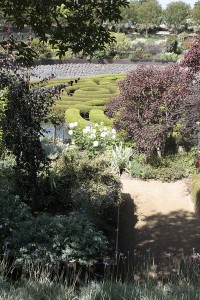
If you’ve never been to the garden, it divides into two large parts: a central bowl holding a maze of two colors of clipped azaleas and its surrounding plantings, and, above it, a straight watercourse that is shaded all along its length by London plane trees, a cousin of the American sycamore.

This trip I was concentrating on how the idea of light and shadow, dark and light played out in the overall design and plantings.

To experience the upper watercourse, you follow a path that zigzags back and forth. It takes you in and out of the shade and shelter of the trees, letting you experience the bright Los Angeles sunlight and how it contrasts with the dappled light the trees provide in the spring, summer and fall.

The watercourse near the top of the Central Garden

The watercourse, the sheltered core of this top garden, changes from a noisy stream with large stones in its path at the top, to a waterway that glides quietly over a textured streambed down below.

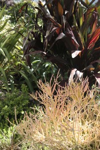
The effect of the dappled sunlight is repeated in the plantings. Dark, almost black-leaved, plants alternate with light-colored ones. In this photo it’s almost hard to distinguish the alternating light and shadow of the trees above from the dappled plantings below. It’s a little confusing, a tad disorienting. And if you’re fascinated with the effects of light and shadow as I am, you might find it a quietly thrilling experience.

Even this little detail, a planting of succulents, plays with contrasts, light and dark. It’s a little corner that would look great in a home garden, and here it further helps to reinforce the vibrations of light and dark in the upper garden.

When I first saw the garden I thought the plantings were a little chaotic. All this light and dark, all this continual contrasting of colors and plant shapes seemed restless. Small doses would look great as perky little container plantings, but it seemed way too much of a good thing. It seemed like a little English cottage garden doped up on steroids.

But I’ve been changing my mind. All this craziness reinforces the intense vibration of contrasts that you experience walking the zigzag path.

Once you make your way out of the upper portion of the garden you’re set free into the relative calm of the lower bowl. There’s no more zigzagging in and out of the shade, there’s no more quick shifting from light to dark. Still, the sunken design of the lower garden ensures that one of the sides will experience shade during most of the day. And the plantings down here, still alternating dark and light, tell you that you’re still in the same garden.


Yes, each trip here I see something new. But I also realize that making this kind of garden happen is such an extreme commitment of resources and labor.

I haven’t quite figured out a way to photograph the capital outlay it takes to keep this garden looking great. But I’d like to end this post with a tribute to the heroes, those dedicated gardeners who make this place a garden worth visiting several times a year.

Thanks, guys!

interesting, challenging reading

This is a post for the reader who might enjoy an occasional book on gardening and landscape architecture that isn’t designed to sit on your coffee table or nightstand.

The British Library has recently unveiled EThOS, a portal to electronic theses and dissertations from the UK. If the thesis has been digitized, it’s available to you for download once you register. Registration is free, and so are most of the texts. If something isn’t available yet, you can request it to be digitized within thirty days so that you can download it. Once again, that process is usually free.

Only a small minority of theses and dissertations written these days is on gardening of course, but there’s some great work being done on the topic in British institutions, with the University of Sheffield leading the way.

Do a basic search on “Sheffield” and “landscape” and you’ll get titles like the following that are available without waiting thirty days:

Wu, Jiahua. Landscape morphology : a comparative study of landscape aesthetics.

Jorgensen, Anna. Living in the urban wild woods : a case study of the ecological woodland approach to landscape planning and design at Birchwood, Warrington New Town.

Alturki, Ashraf. Attitudes towards designed landscapes in two desert cities : Medina, Saudi Arabia and Tucson, Arizona.

Zhao, Jijun. Thirty years of landscape design in China (1949-1979): The era of Mao Zedong. (The abstract for this one outlines some fascinating ideas about designed landscape and ideology: “[L]andscape architects first emerging in early twentieth century China concerned themselves especially with the design of gardens and parks. This situation remained almost unchanged during the radical socialist revolution, which resulted in the founding of the People’s Republic of China in 1949 that was led by Chairman Mao Zedong (1893-1976). During the Mao era (1949-1979), the impact of the Chinese communist ideology on landscape was far-ranging and ground breaking. Besides extensive development of public parks for socialist education as well as recreational purposes, cities were reshaped with large housing areas created for workers–the proletariats, and urban squares playing a crucial role in exhibiting political power, while the countryside was reshaped from a hierarchical landscape with an exploitative nature to an egalitarian one, where the broad masses were to benefit from improvements.”)

Alternately, try a search on “Sheffield” and “garden” and you’ll find titles like these, digitized and ready to download:

Gilberthorpe, Enid Constance. British botanical gardens in the 1980s : changes reflected by bibliographical and social survey.

Kellett, J.E. Public policy and the private garden : An analysis of the effect of government policy on private garden provision in England and Wales 1918-81. (Sheffield City Polytechnic)

…and then there are intriguing titles like these that still need to be digitized though you could be reading them in not much more time than it takes for a book to be delivered to your doorstep:

Qasim, Mohammad. The potential role of private gardens in developing greater environmental sustainability in cities.

Cannon, Andrew R. Wild birds in urban gardens : opportunity or constraint?

Be forewarned. From the skimming I did, these texts read like…well, college dissertations. Even among the authors who write really clearly you sense a certain amount of them playing academic buzzword bingo. After all, the authors have to tell their profs that they know the literature and can use their lingo. In addition, the photos accompanying the texts aren’t picture-book quality the way they appear online. But once you get beyond that, you cross over to a world rich in ideas.

[ Electronic Theses Online Service ]

fairly cool plants

On my recent trip to the San Diego County Fair the horticultural displays seemed to divide into two big categories: exhibits that featured cool designs (usually entered by a landscape design firm or individual) and those that feature some pretty cool plants (mostly in exhibits assembled by specialty nurseries).

I’ve talked enough about the cool designs. Here are some fairly cool plants. Some have been around for centuries, others are fairly new to our gardens. Hopefully the new introductions are fairly tame, otherwise you might be seeing here the new exotic weed pests that’ll be keeping us busy for the next hundred years.

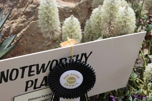
Ptilotus exaltatus 'Platinum Wallaby,' a plant that has been showing up in nurseries this past year.
Oh look: Another noteworthy plant, another ptilotus, Down Under.
Christmas in July? The Ecke poinsettia ranch folks who supply a huge percentage of the world's poinsettias were showing off this new white variety, Polar Bear. My county used to be poinsettia central for the world, but cheaper production costs have driven a lot of that to Central America.
Chartreuse, green, white and near-black: Lobularia Snow Princes, two kinds of ipomoea, with Coleus ColorBlaze Alligator Tears.
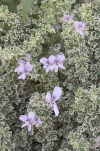
Geranium crispum, variegated form. This is one of many foliage plants that have flowers that don't seem to add much to the foliage.
Gosh, yet another noteworthy plant with a 'Noteworthy Plant' sign next to it. (Kinduv reminds me of those turnoffs labeled 'scenic viewpoint' on highways through spectacular landscapes, as if you needed the sign to tell you you were looking at something scenic or--in this case--noteworthy.) This was labeled a 'Pine Needle Fern,' but not with its species name. My quick web trawl didn't turn up much with that name, only a fact that it's considered one of the more primaeval kinds of fern. Very cool, whatever it is.
Rice flower, Ozothamnus diosmifolius, a plant drought-tolerant selection that, like the ptilotus plants, comes from Australia. You'd think they'd have run out of their notable plant signs by now.
Mention the word succulent and people have visions of a fairly desert-ey landscape. Here's a display by Cordova Gardens that instead comes off as a really lush flower arrangement.
Deuterocohnia brevifolia, a fairly amazing succulent. (Edit: this is actually a bromeliad!)
Mammilaria parkinsoniana, a fairly amazing cactus.
A nice mixed planting of cactus and succulents at the Solana Succulents display.
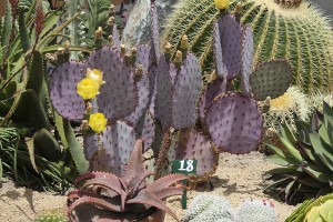
A gorgeous purple prickly pear Opuntia Santa Rita, part of the Solana Succulents exhibit.
Agave victoria-reginae, a normally prim little bundle of green and white botanical joy. Check out bloom stalk in the next photo, however...
OMG, when that thing blooms, stand back! This little two-foot plant has probably produced a twelve-foot inflorescence. How do you design with this plant? Is it a foreground plant? Or something for the background? Not a bad quandary to be in.