The house projects continue. We’ve worked around my little studio building and are now on the final stretch, 22 feet of wall that backs a raised planter. There’s only one window to worry about on this wall, but all the plants are making it a delicate demolition operation.
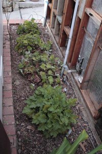
Some of the greenery is looking a little trodden on. This is a row of island coral bells, Heuchera maxima, that hasn’t escaped the occasional stomping on by a random foot. But for the most part these should look okay in a couple months after the rains perk them up.
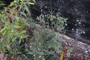
I pruned this plant out of the way. It’s my only rose, the green rose that I’ve been growing since my early teens. September and October aren’t prime rose pruning seasons, but I’m hoping the plant doesn’t mind too much.
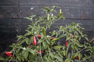
This plant, a Bonbero hot pepper, so far has escaped being stepped on or having pieces of old siding dropped on it. It’s nearing the end of its short period of productivity, so I won’t stay up nights worrying about it. Still, now that the hot peppers are coloring up red against the leaves, I’d miss having it in the garden.
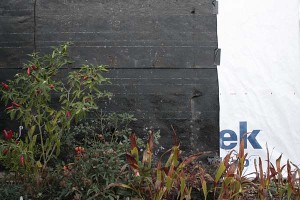
We’re still undecided about what color to paint the siding once we get it up. I was thinking dark and dramatic, and only somewhat kidding suggested to John that we “paint it black.” When we got down to the final layer of old tarpaper it was a chance to preview what a dark color would look like behind the plants.
Here’s the black of the tarpaper with the new white Tyvek house wrap for contrast. The white looks awfully harsh against the plants in the foreground. White is a good to accentuate some sinewy branches or the architectural contours of a dramatic plant. But the contrast between the white and the plants is really extreme, and we probably won’t be going with light colors. The dark colors recede nicely behind the plants, a feature that might be nice in this narrow garden space. The leaf colors contrast against it gently, but I worry that the plants might get a little lost.
One of the really popular tinted stucco colors being used in the neighborhood right now is a dull dark green color, which to me seems like the worst color possible for setting off green plants. Silver-leaved meditteranean and native plants can stand a chance of contrasting against it, but it’s pretty deadly for leaf-green plants. So we definitely won’t be doing dark green.
But a dark urban gray? I even thought of a dark red, but the house came with what seems like ten acres of brickwork, so I think that’d be too much as well.
We still have a week or two before we commit to a color. What would be hip, soothing and flattering for plants all at the same time? I’m one of those people who could spend hours looking at paint swatches, but that’s easier to do than the hard construction work that I need to get out of the way before getting to paint colors.
That said, I’m still a big believer in the power of color, and it could be more important decision in the long run than where we decide to move a wall outlet. Decisions, decisions…


When I have to decide on a color choice, I sometimes go to a fabric store for inspiration. And if there’s a color I like, I buy some of the fabric and try it out. Much cheaper than painting, and you can often return the fabric (minus a cutting fee).
Is this an accent wall? Then maybe a nice buttery yellow? If not, maybe a washed-out California gold (the color the hills are in summer). I’d stay away from dark. It sort of works for greyish leaves, but not very well for green. I’m surrounded by fence, some darker, some lighter. Lighter is better, trust me. (If you must, maybe some slate color, on the blueish side, would work).
What a fun challenge! I love color decisions.
I suck at color decisions. I’ve been cogitating but am glad Town Mouse got here first and those sound like good ones to me. Buttery yellow – I can see that. Or some kind of buff yellow. It was an interesting observation you made about the effect of the black tar paper vs the and white tyvek. Wishing you a speedy and altogether satisfactory conclusion to your projects!
Looking at your lawn-gone post, I am thinking gray. Check out this picture: http://www.trendir.com/house-design/seaside-home-design-paulo-david-2.jpg
Slate gray. The only thought is that tight, small spaces will shrink even further if the house color is dark. Accent with something warm that plays off the brick.
Colors are hard – but fun!
Thanks for all your ideas!
TM, I really like the fabric idea. I’d probably be attracted to polka dots for the studio wall. Why decide on only one color! There’s a piece of wall nearby that will be more of an accent, so something that recedes is sounding most compelling. The faded gold could work.
CM, thanks for the wishes for the end of this project. Normally I’m doing a rain dance this time of year, but I’m hoping–selfishly–for a little more continued dryness.
Barbara, I have a pile of swatches that are near the color of the house you linked to. Seeing the darker value on a wall is really compelling. I have dark green on the fascia that I was feeling too lazy to repaint. The color would tie the studio to the rest of the house that has the same color. But something acknowledging the brick would be a good effect.
James, thanks for acknowledging my comment of a few posts ago. Love the green rose photos. Given your lack of frost, you probably don’t need to worry about when you prune. (Oh, I miss the coast!) Keeping the leaf litter tidied up should help avoid powdery mildew. Kudos for nimble-footed construction around plants!
What’s wrong with having the only pale lavendar house on the block?
Hey, I want to hear more about this green rose, please. I love that you’ve known it so long. Are the blossoms green?
Janis, working around plants takes twice the time. I can see why they usually get trampled or removed!
Greg, I might have to be satisfied with pale lavender flowers in front of the wall… lack of courage or imagination… The rose has green “flowers” that have no petals, only a huge rosette of green sepals. Just check out the links in the post if you’d like to see pictures.