These are the last of the photos I took at the gardens at CornerStone Sonoma. Looking through this second batch it seems that the gardens below rely heavily on hardscape details and less on plants. None of them are gardens without plants, but the green stuff definitely plays second fiddle to the more engineered parts of the gardens.
Yoji Sasaki’s The Garden of Visceral Serenity features this terrific walkway: a central, solid strip that alternates with horizontal stripes of varying widths.
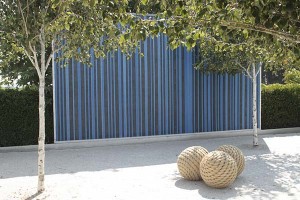
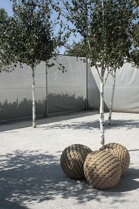
Topher Delaney has this striking installation made up of a very short menu of elements: a blue-and-dark-gray striped wall, birches, three balls made of rope, white shade cloth surrounding the space, a bordering hedge and white crushed stone beneath your feet.
The color palette is reduced down to white, gray, black, green and the insistent blue of the backdrop and–today, anyway–the sky.
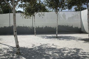
Most people plant birches because the trees have striking white trunks. But with the ground and walls being white, the birch trunks almost disappear, leaving a sense of green sheltering foliage floating overhead.
At mid-morning, the shadows of the trees draw striking forms underfoot, and shadows of the plantings next door make soft patterns on the white shade screen.
I liked this detail at Walter Hood’s Eucalyptus Memory garden. Garden designers often use single chairs or long benches to suggest a point of repose in the landscape. Here, Hood has used two chairs next to each other in the foreground and three in the distance, next to a pond, instead of the more expected bench. I wonder, is the fact that you have a chair to yourself meant to reinforce your sense of interior contemplation, even when there’s someone sitting next to you?
The rest of Hood’s installation consists of very few materials. Most dominant are two tall mesh panels that frame a view to a distant pond. One side is empty, the other contains eucalyptus branches and leaves. After a few moments of looking at the garden, what hits you next–and hits you hard–is the smell of the drying eucalyptus in the one panel. This is a garden for more senses than just sight.
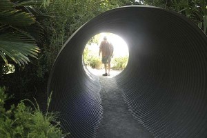
Another sense, that of sound, is reinforced in David McCrory’s and Roger Raiche’s Rise garden. A steel tube runs through it, the kind that you see used for drainage under a road. As you walk through it you feel a sense of shelter, and the sounds of the surrounding world change as they echo gently through the chamber.
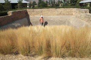
Pamela Burton designed the last of the spaces that I wanted to share. Her Earth Walk burrows into the land, and requires that you descend into the garden to fully experience it.
The earthen color of the hay bales and the adobe mud walls reminded me of the desert.
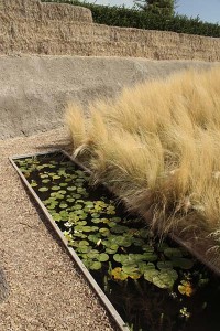
Once you pass a big, solid of Mexican feather grass and approach the bottom, you’re surprised with a long rectangular pond with waterlilies and fish. It felt like an oasis.
By the time you drop the eight feet or so into the bottom of this installation you can’t see any of the gardens around it. What you experience is reduced down to the walls, the grasses, the sky above, and the water below.
My final reactions to visiting Cornerstone were similar to going to a little museum and seeing a collection of single works by a number of artists. There’s a little bit of tension, a bit of competition going on between the pieces. Some landscape architecture can work well this way, where the designer makes a statement and you can appreciate what’s being said. You then move on to the next piece and try to figure out what’s going on with it. But if you want a landscape architecture that’s deeply rooted in the surroundings and its history, you might leave here wanting more than many of the works deliver.
In the end, one thing Cornerstone did very well for me that a lot of other landscape architecture doesn’t comes from the intimate scale of most of its gardens. These are gardens the size of many residential lots. These are spaces that tell you that interesting landscape design doesn’t have to be scaled to massive public works or some gonzo pallazzo.
For more looks at Cornerstone Sonoma, check out Alice Joyce’s postings on her blog, Bay Area Tendrils Garden Travel.





I really enjoy these types if intersections in gardens. I spent most of last year researching garden history and design for part of a book, and although I think most people would find your images uncomfortable (right word?), it’s simply the natural evolution of the garden–even resembles / continues so much of the conversaton of the Victorians, Greeks, Persians…. I enjoy Burton’s work bove espeially and would love to someday have this sort fo element in a larger garden of my own. For now, I settle for a few sculptures here and there. Thanks for letting me stumble my way here!
I like these – and in a fire-prone landscape, use of such architectural elements helps to give a vertical dimension disallowed for vegetation close to the house. Just I would avoid the total minimalist aesthetic – some of them are a bit bare bones for me.
The last example put me in mind a little bit of Andy Goldsworthy’s work. I’d love to do some things here like he does – his sculptures use natural and sometimes quite ephemeral materials in the landscape.
Benjamin, thanks for stopping by. Designed gardens and vernacular gardens can seem poles apart. I could see that comfort might not be people’s first reactions to these spaces, and I think the designers were aiming for something else. It’s a tough one since early gardens do seem to play up the comfort factor–does a garden succeed if it doesn’t have a comfort factor? I’ll answer yes, but these gardens might not read as gardens to some people.
CM, I think your viewpoint in gardening celebrates the natural world in a state that comes close to nature itself. Some of these might seem to kowtow more to human intellect than nature. (Besides, what gardener would be satisfied with a garden of ONE kind of plant?) Your Goldsworthy example is a beautiful one that shows a wonderful way to balance the two seeming poles.
James, It’s fascinating to get your perspective on these installations, after studying and responding to them since they premiered. I love seeing your photos – what your eye selected, and how it’s framed. Your take on Walter Hood’s garden seems particularly insightful. Burton’s is my favorite, and here again, your images allow me to see it afresh.
Thank you for the link! btw, I’m in Marin County, adjacent to Sonoma. A pretty quick trip from here to there. But no cows nearby :~)
Yes, they won’t read as garden to some people, but after a few moments, I hope they would read as such to most if not all people. What is a garden? That hard-to-nail-down philosophical question. A place to connect to something hire than yourself–perhaps consciousness, perhaps an a-ha moment–a place that bridges the gap between you and every other physical and emotional and spiritual impulse. I work on a university campus where gardens and sculpture are exhaustive, and all my students appreciate it (so they say). We go outside and write in the garden spaces on the sculptures, and time and again the students say how they left seeing and thinking in a new way, felt peaceful and connected–I think that’s the garden, the art, the outdoors, and the writing, all in harmony. Perhaps the garden is such a moment. (forgive me for going on and on here!)
Alice, quite frankly at first sight I wasn’t prepared to love Pamela Burton’s space. But as I’ve had some distance from my visit, it’s the one that resonates with me the most. I think it was the bravest, least garden-like of all the installations, one that is hard to capture in photos and has to be experienced directly.
Benjamin, it sounds like you’re arguing for a garden being as much a door as a destination itself. We’re used to that door opening onto some sort of approximation of nature, and I dearly love gardens of that sort. But it can be so much more memorable when the door leads to something else magical and unexpected, something that as you say knits together so many kinds of thoughts and experiences. Some of my favorite writing I’ve done has been in the driver’s seat of my car, parked in a campsite, after the sun has gone down and the space comes alive again in my memory. Spaces are terribly important.
Much as I admire the clever design, I do wonder what the wildlife value of these gardens is. But maybe there are a few blooming plants tucked away outside the photo.
It’s interesting how these gardens contrast with the green roof of the Academy of Sciences, also very cutting edge but humming with insects enjoying the flowers.
Interesting post James and one that obviously gets people thinking. The question “what is a garden?” is one that comes to mind often for me, as I am sure it does for every gardener/designer/blogger eventually.
I had the pleasure of hearing Topher Delaney speak recently and she is a dynamic, engaging and amusing presenter. I’m particularly intrigued by the use of color and space in her garden. As a designer, I enjoy gardens like these, whether visiting them myself or browsing your excellent photos and commentary, because it helps me think outside of the box when employing basic design principles for my own more traditional designs. But I must admit, I can’t imagine choosing a garden like this to live in – as you said, it’s more like visiting a garden museum. Yet based on the photos of private gardens Topher shared at her presentation, people do.
James,
Burton created a garden that hearkens to the earthworks/earth art movement: She sculpted the earth. And I believe it must be experienced to get it.
Spare modernist spaces such as Topher’s design at Cornerstone, their ‘je ne sais quoi’ – not for all tastes, but each has its own particular assets.
After years of being immersed in plants, a part of me yearns for the clarity found in a modernism where the elements of plants and hardscape add up to more than the stated design. A design that resonates. Like a work of art.
Perhaps Andrea Cochran’s work demonstrates what I refer to above. (once Topher’s partner in Delaney / Cochran ).
A new book out on Andy’s designs & beautiful images is reviewed on L + U
Link to Jason King’s review:
http://landscapeandurbanism.blogspot.com/2009/08/reading-list-andrea-cochran-landscapes.html
Very interesting post and discussion. I wonder if designed gardens such as these aren’t like high fashion: very few people actually wear the clothes, but their design influence trickles down to clothes that are actually wearable (and affordable).
I really enjoy the way you look at design elements, and how you think about their effects. You’ve got a MeMe award awaiting you (http://www.tulipsinthewoods.com/cataloguebookwebsite-reviews/beautiful-blogs/), should you decide to accept it. If all the linking and writing doesn’t appeal, know you are appreciated and leave it at that.
I think you have to be there. My experience looking at the little pictures on my computer screen is more like visiting a gallery of artworks than visiting a garden. I don’t deny these may be meaningful uses of space and materials, but I can’t tell from here. Who or what organization sponsors Cornerstone Sonoma? Does it/do they have an agenda?
I haven’t been there, but it seems like the flower and garden show, a place to see hardscape and design elements rather than plants. It’s a reminder of how many landscape architects are former art students. My parents, non-gardeners, have been to it, and it seemed like they needed to make a big effort to appreciate it. They kept calling it “interesting.” I’ll have to check it out sometime. Thanks for the photos.
TM, there was an interesting podcast by James Hitchmough as part of the BBC Gardens Illustrated Vista lectures: http://www.gardensillustrated.com/podcast_vista.asp One of his points was that invertebrates don’t care if their plants of choice are in a wild-looking garden or in a mock-Versailles planting. Of course, that’s assuming that the bugs will find plants at all, something a few of these gardens I looked at lacked in significant numbers. There WERE a few gardens at CornerStone that were brimming with greenery.
Susan, there’s definitely interesting garden design that’s being done that might do a better job of pushing the buttons for a gardener. A lot of these spaces seem like they’d feel me deprived of all the cool plants I love. I agree that they’re on the spare side. Although that pushes my buttons that appreciate a certain amount of order, in the I’d like to live with something that is more effusive.
Pomona, I like how you view these as haute couture gardens versus the ready-to-plant ones that most publications seem to present.
James, some of the spaces look quite a bit like their photos, others slide into the totally unphotographable. The Pamela Burton garden in particular. I get a sense that Cornerstone is an ambitious private venture–You have to pass through the multiple shopping opportunities to get to the gardens. I got a sense that it’s been a somewhat hard sell.
Ryan, the one way these spaces differ from a typical garden show is that some have been in place a while so that the plants aren’t just fresh out of a can. “Interesting” is a good word for it, and in the end for me it’s a compliment: Better to fail in a provocative way than succeed at something that’s easy to do. Yah, maybe it’s my own art bias coming through here…