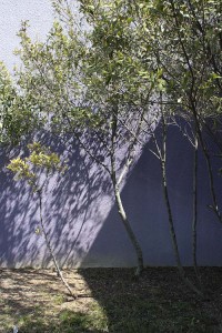
I still haven’t gotten around to doing something about the color of the my little detached studio behind the house. Colors of residential neighborhoods and garden walls usually tend towards pretty neutral shades. Here are a couple combinations of walls with plants that I thought were pretty dramatic while still being flattering to the landscaping. They could be interesting choices for garden walls or even–if you’re truly brave–walls of your house.
This first one is the freeway side of the Tustin Marketplace in Orange County, as see from Interstate 5 on my way up to LA last week. The fairly dark burnt red-to-salmon wall coloration mixes dramatically with the green bougainvillea foliage and reddish magenta flowers in the foreground. And the silver trunks and bright green foliage of the trees in the background stand out dramatically against the wall.
 The second is another retail situation, the plantings by the parking lot at the Mission Valley Mall here in town. The violet wall, as the preceding reddish one, once again plays against the silver trunks of the trees and the bright green leaves.
The first combination to me feels warming and energetic without being too hyper, with the red being a color that isn’t so far removed from the Mediterranean themed housing that continues to be popular in Southern California. The second is definitely cooler, more restrained–and maybe a little more urban and adventurous.
We’ll see how brave I am when I finally have time to address residing the studio and rebuilding the attached patio cover. But I’m definitely feeling like doing something other than white or beige this time…


I like color and character, but you should surely make sure it is not too much and something you can live with. Both of the examples you showed are nice.
I love the colours of the second picture, the violet and silver work beautifully well. James – go violet – go on!
🙂 it would be fab!
A good friend who is a painter had her house painted in a rosy color (salmon?) and has matching geraniums and roses, combined with blue Iris and other blue plants (as well as some green). It’s absolutely stunning.
I do wish people would be more adventurous in their paint choices–There are many colors out there that are still friendly enough that they’d wear well over the years. The one color I’d like to see people avoid, though, is, of all colors, dark green. A neighbor just redid their house in it, and you can’t tell where the house stops and where the garden begins. Zero contrast. Things just get so lost. Too bad…